When talking about chair rail ideas, it’s not actually talking about a rail for a chair. It’s the name of a mid-wall molding which actually has less to do. It’s more about scale and proportion. If you know more about chair rail, knowing how and why it would drastically affect the feel and look of your space.
[su_note note_color=”#feeacf”]Originally, a chair rail was used to protest the wall from the damage that is made by the chair. Usually, it’s placed in dining rooms that have many chairs in the dining set. But since it adds a nice touch to the wall, the chair rail become the addition to give pleasing visual and architectural interest to the room.[/su_note]
The dimension of the chair rail should hit about 1/3 up the wall. You need to avoid it for being too high because it would make the room to feel squat and off. If you are worried about the high you set, you can go lower, it would be safer.
So, if you decide to have a touch of chair rail ideas in your house. You need to finish reading this article, there will be many inspirations will be provided here. Be ready to give your wall a little functional charm.
Types of Chair Rail
Before we move on to the chair rail design ideas, you may need to know some types of the chair rail. Each type has its own charm and adds a different character to your room. Here are three popular chair rail molding designs and styles available for your house.
1. Simple and Plain Styles of Chair Rail
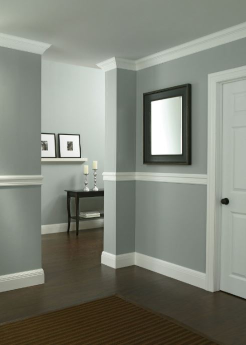
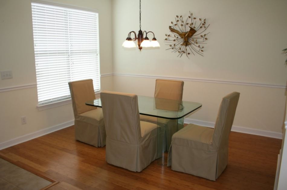
This is the styles that are very common, you will be easy to find this style in many houses. The plain chair rail would allow you to add color to the space to meet the design you plan.
For example, you can get the chair rail to be suitable for Art Decor style, Victorian theme, or Natural Rustic design.
As you can see in that picture, it looks really simple. It won’t bother or blur out your current style. So, it’s so ideal to be the addition for your remodeling project. This plain chair rail has a basic color combination between gray and white.
Pros:
Playing with basic color would always be safe and clean. It would get people more comfortable to be around. The sense of clean and light seems to be the highlight of this room. Going with simple plain style for chair rail would be an ideal idea to play safe.
Cons:
Some designers wouldn’t recommend the homeowners to play safe. Well, you need to be creative to play with colors. Add a little accent won’t change anything to your room, says those designers.
2. Two-Toned Wall of Chair Rail
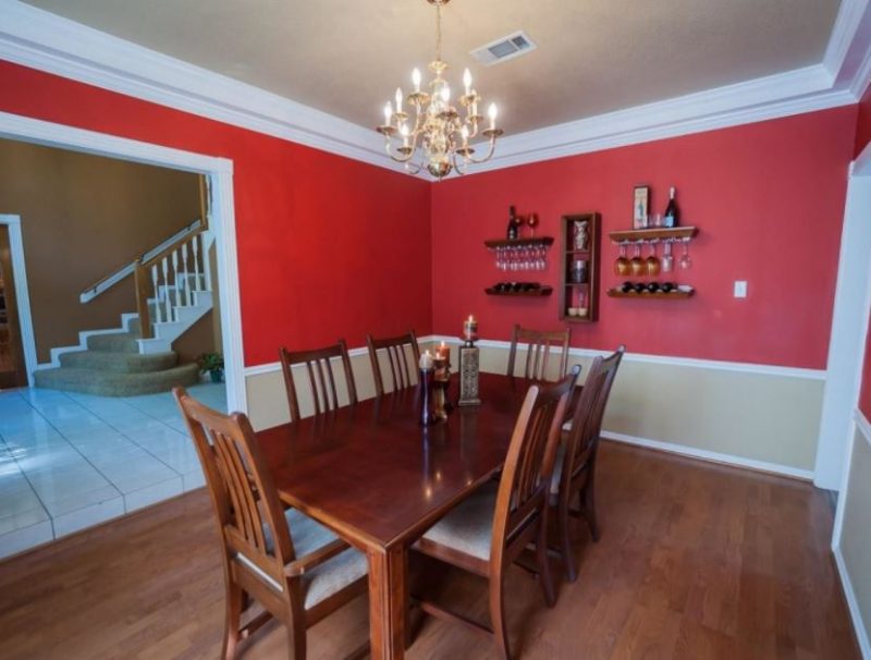
Splitting up the color on the wall with chair rail is quite popular. You can choose the color or style that support the two-toned paint concept. It would get the separation between the wall and the chair rail more obvious.
Take a look at the photo, there’s a big difference between plain and two-tone. The contrast of the color combination is very obvious.
You have two level of walls, one above the rail, another one below the rail. You can choose to have either the bottom or the upper part of the wall has the darker shade.
Pros:
This room looks alive and fresh. The contrast of the color is very brave. The bold red color plays really well with the white rail. The cream color below the white rail is also a great way to match the wooden elements in the room.
Cons:
Two paints would cost more than one paint. So, you may need more budget comparing to the plain one. If you still choose white or another similar neutral color to be combined with the main color of the wall, it would be useless because all the rail is painted in white, mostly.
3. Ornate Style of Chair Rail
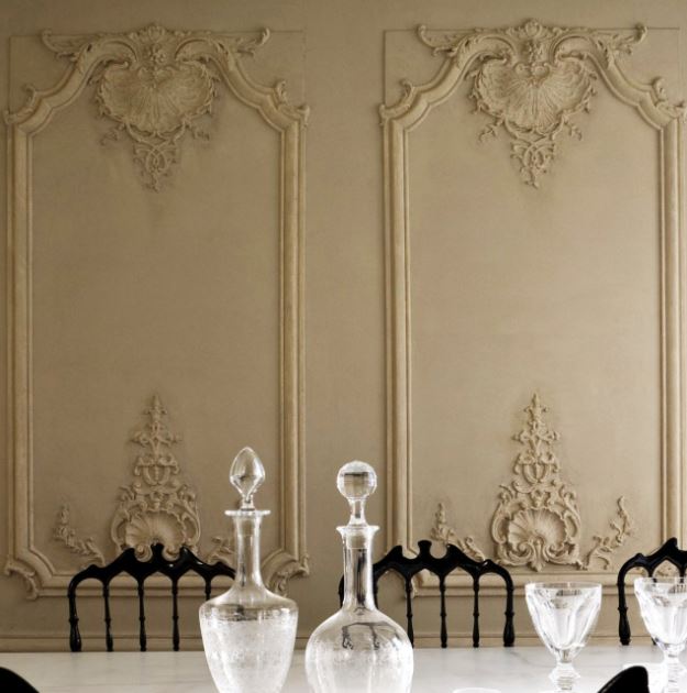
The ornate chair rail with a thickness dimension at eye level height would add a surprising and dramatic design element to the room. This would look like a typical wallpaper border in order to bring detail with a new and updated form.
This is a great idea for you who want to go with the luxurious style of the chair rail. The more ornaments that it gets, the more luxurious it would be.
As you can see, this dining room looks glorious with that molding wall. The antique texture and design let the atmosphere spread the feel of luxury.
Pros:
The gorgeous looking luxury on your wall would take your room design and atmosphere to the next level
Cons:
Sometimes, it gets too over.
Recommended Chair Rail Ideas to Apply
1. Wyndmoor Residence Dining Room
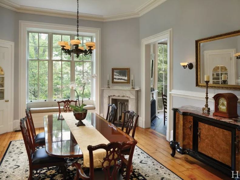
Check out this amazing dining room. The playing chair rail design feels on track with the room design. The soft blue color of the wall let the other dark wooden elements speak for themselves. This picture is taken from Hanson Fine Building website.
Usually, the simple chair rail would be pleased to be set as the background of the room. However, it still plays a big part in the whole atmosphere.
Pros:
The soft wall color blends well with dark woods. Adding chair rail into the wall design would support the classic style you apply in the room.
Cons:
Its charm is only getting a small portion in this room.
2. Chair Rail Ideas in Sarah’s House
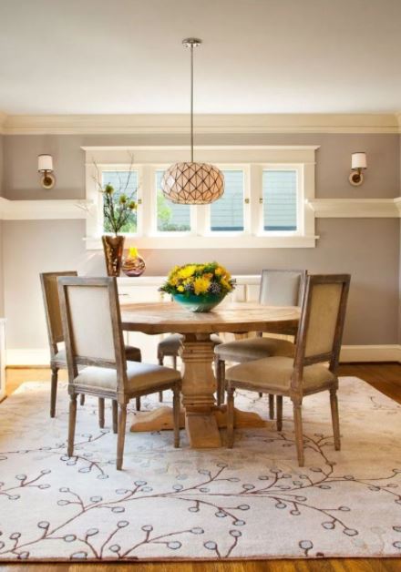
Designing by applying a picture design makes your work even simpler. You can just simply select the design you like from the pictures and let the designer imitate the picture.
In molding design, it would be a lot simpler because simple molding can be installed by professionals and also by yourself.
The level of the chair rail in this photo is higher above the chair height. The purpose to have it that way is to level the windows. The dining room looks so balanced. Sarah is very clever to decide where to put the elements.
Pros:
That four windows are the focal point in this dining room besides that lighting pendant in the center. The chair rail gets it even better in order to balance the look.
Cons:
The level of the rail is too high, it wasn’t supposed to be that high.
3. Chair Rail Ideas with Floor Covering
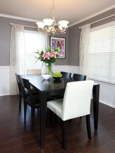
This dining room has a floor covering that looks like wood. It’s not actually a wooden flooring, it’s a stone flooring. The chair rail has a neutral combination which is a pretty safe choice for the designer. There’s no dark color on the wall, the dark color is only available for other elements but a wall.
The wall should be in tone. The soft grey color is well combined with white chair rail and bottom wall side. There’s only one white chair at the dining table, it represents a leader or the most dominant seat for the important person at the house. It also matches the white domination on the wall.
Pros:
The clean dark dining set looks gorgeous when it’s closed with that white chair rail.
Cons:
There are two big windows in the dining room which are not recommended by professional designers.
4. Chair Rail in Standard Dining Room
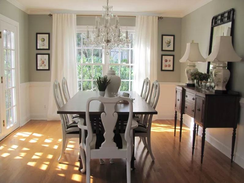
The only elements that really obvious in this room is the large doors. There are two large see-through doors in this dining room.
It might be there to provide enough lighting at day. As you can see, the amount sunlight that enters the interior adds a dramatic touch to the floor.
You may need to control the sunlight that enters the dining room which can be a disturbance. Well, the white curtain over there would be a pretty good solution to that.
Pros:
That luxurious lighting above the dining table really set a good mood for dinner time.
Cons:
The style is confusing in this dining room. It’s not contemporary at all, it’s also not classic. Well, I guess according to the elements that this room has got, it’s mixed.
5. Goshen Ridge Design House with Chair Rail
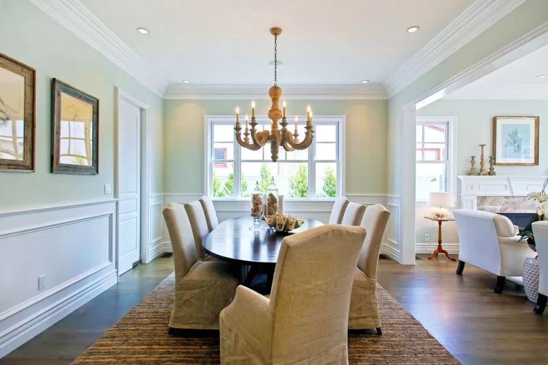
This house’s interior is designed by Goshen Ridge. He installed the chair rail molding to provide more imperial feel into the room. That antique light pendant in the middle of the living room looks suitable, thanks to the color choice of the furniture.
There’s an elegant dining set above brown rug to manage the similar color in the middle. For the chair rail, it uses ornate chair rail. It seems like the living room has a neutral color as the main combination of this living room.
Pros:
The antique charm from the light pendant in the middle and the choice of colors shine up the room.
Cons:
The color choice of the wall is unclear.
6. Chair Rail Used as A-Frame
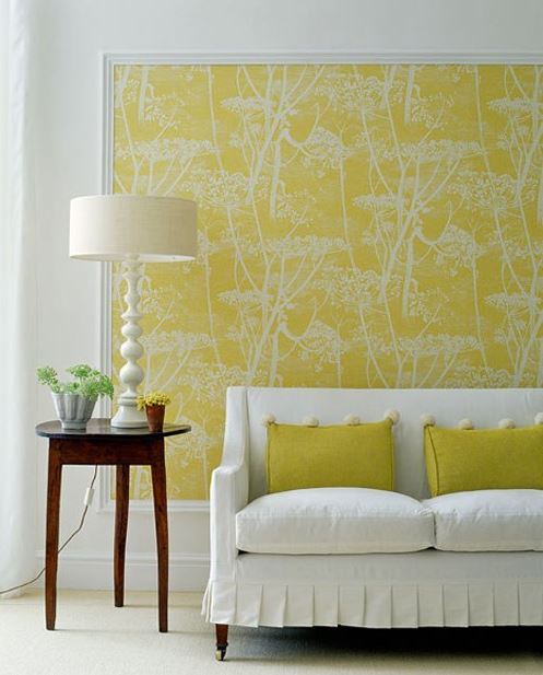
Chair rail design doesn’t have to be empty with plain color. You can treat the rail like a frame of an art. As you can see, this room has a decorative chair rail that was used to frame wallpaper to be oversized art.
The combination of white and yellow really warm up the room. It will make the room more to feel energetic than before.
The artwork is very important in this chair rail concept. Because, if the artwork doesn’t seem to be supportive, you may need to take down this concept.
Pros:
The best suggestion for this is to imitate the concept and the artwork of the wallpaper. Yellow and white seem to be a perfect couple.
Cons:
You can’t call it a chair rail anymore because it’s used as a frame.
7. Chair Rail Trim Over Wallpaper
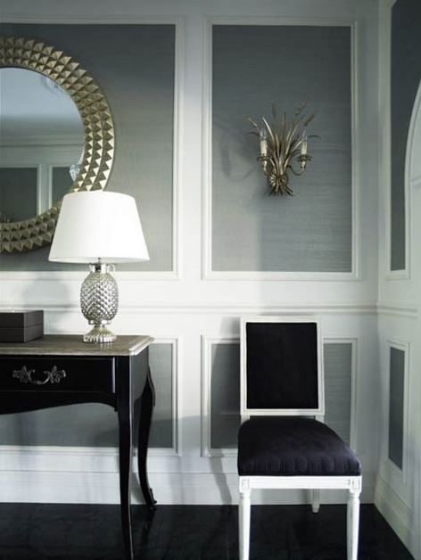
You can simply place the trim on walls over the wallpaper of grasscloth. If you have a concept of grasscloth on your wall, this ideas seems to be the best way to treat it. Picking white as the basic color of the chair rail, and the soft gray as the grasscloth wall color.
This kind of concept would bring out the real elegance of the room. Pairing the wall with black furniture like the picture, that would be perfect because black color is from the same family with grey and white.
Pros:
The super-elegant appearance that you can choose for your interior.
Cons:
The color combination will be monotonous without those two gold accessories on the wall.
8. Chair Rail with Decorative Patterned Accents
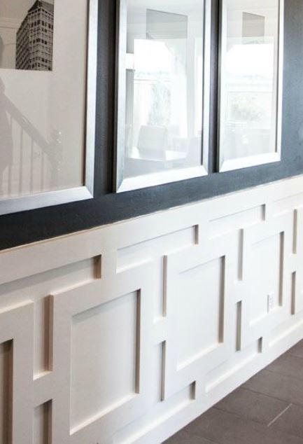
A Flat Geometric Pattern on Wall can be a creative option you could select for the chair rail design. It looks simple and unique.
Homeowners tend to choose a simple pattern for the chair rail. This falt geometric seems a bit more complicated, that’s why it’s not used by many people.
The color has to be white or another bright neutral color because you may need to pair it with bold color. The geometric pattern will have a more dramatic characteristic with bright color.
Pros:
Geometric is a unique option of pattern, that’s the reason number one to have this idea. It looks fun and attractive too.
Cons:
You may have problems in cleaning it away from dust and keeping it always clean.
9. Boxed Cross Pattern Chair Rail
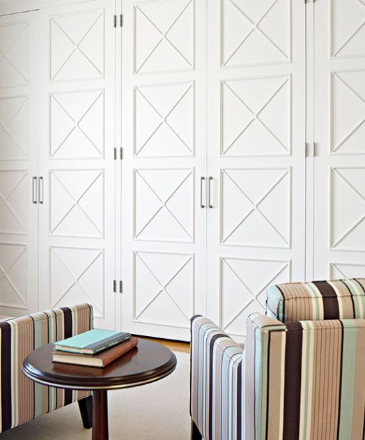
Another simple option of the pattern for chair rail, this boxed cross pattern is a bit different with geometric. This time chair rail is beautifully added to the plain door design. This pattern is quite easy to install. So, I guess it would be a perfect option for your remodel project.
If you have a plain boring wall that needs attention. This boxed cross pattern might be very helpful. Just at it with the same white color as the plain wall, it would make a good impact. However, you can also play with color combination with this pattern. Just be creative with it.
Pros:
Installing this pattern is pretty simple and easy. That’s why this pattern is quite popular not only for the wall but also doors.
Cons:
As you can see, if you install it on all the space on the wall, the wall design will be more monotonous than before.
Conclusion
Overall, chair rail would add its own charm to the mix of your stylish design. It also makes a good separation to a vast wall expanse to decrease overwhelming. Hopefully, all of those chair rail ideas would inspire each one of you to apply the one you need.
I truly enjoy looking through on this web site , it holds superb content .