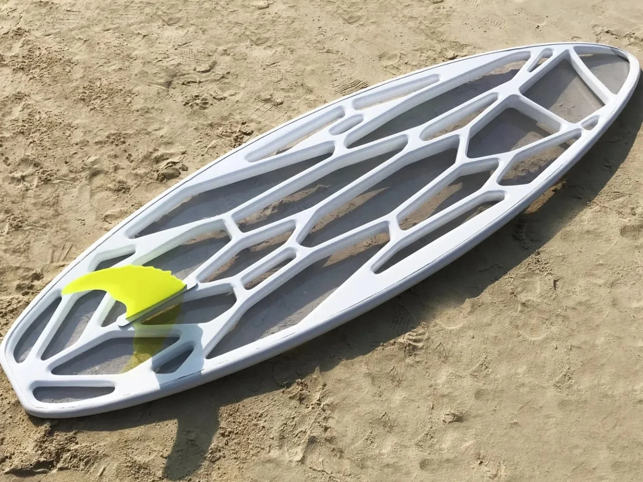
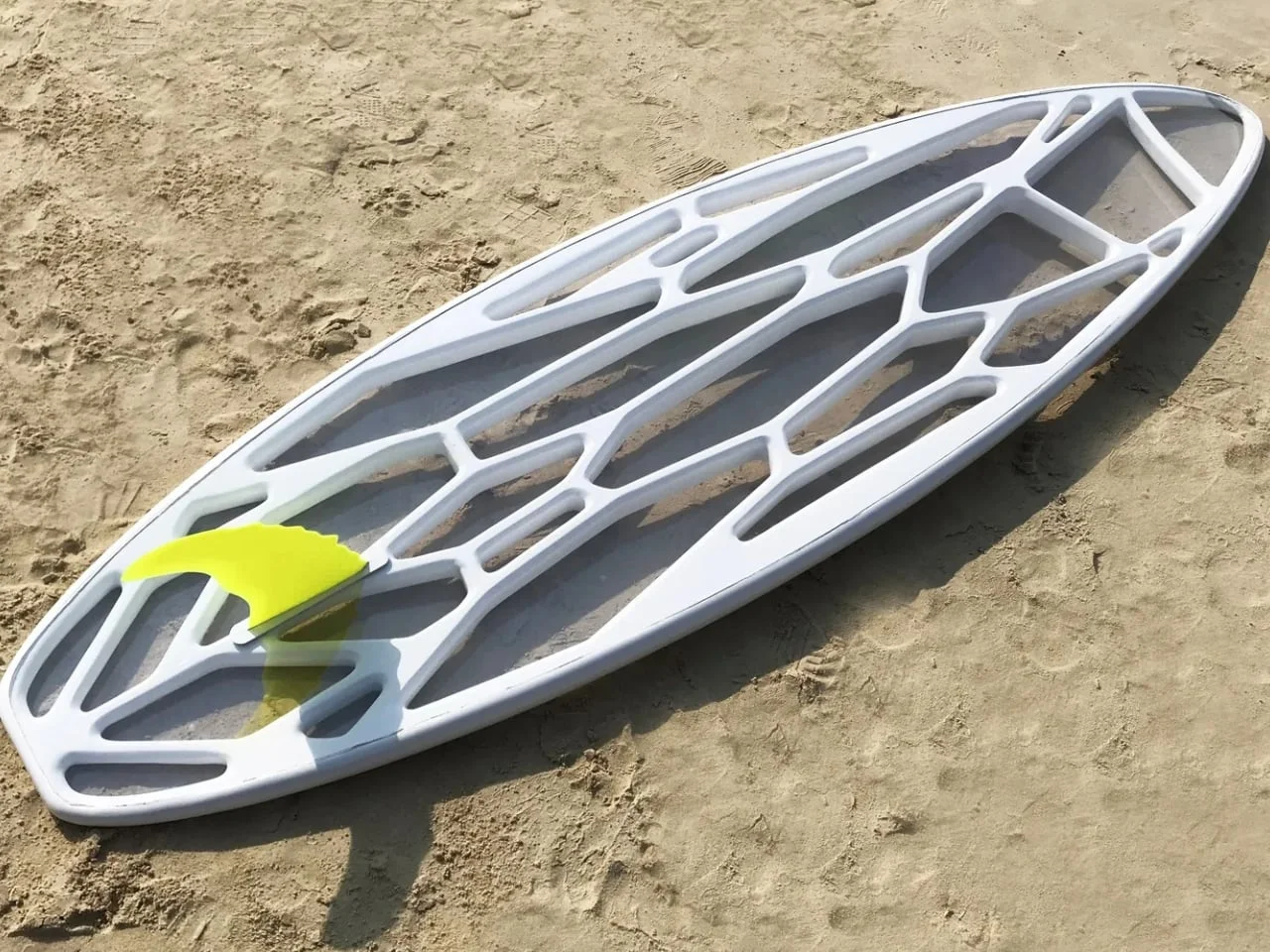
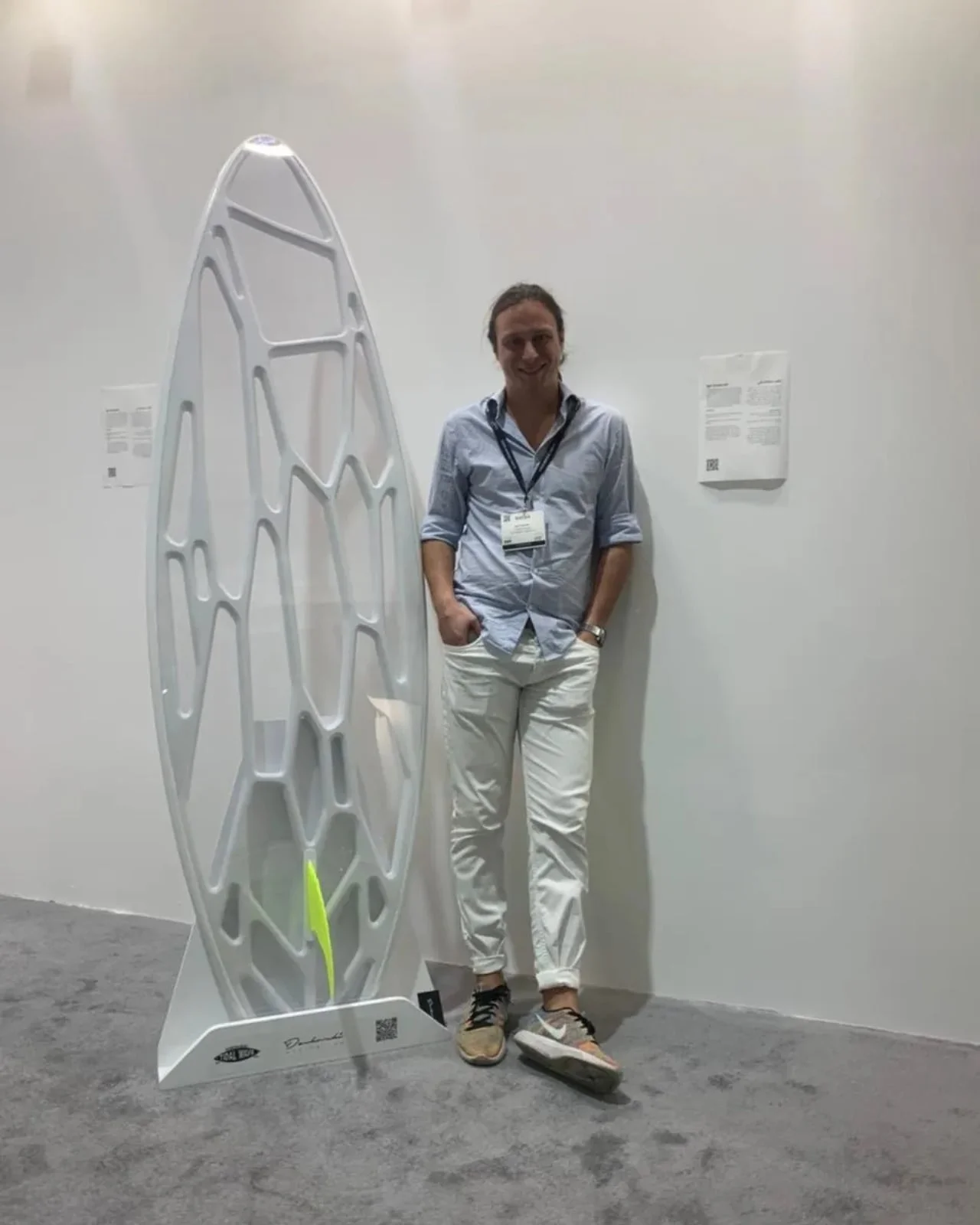
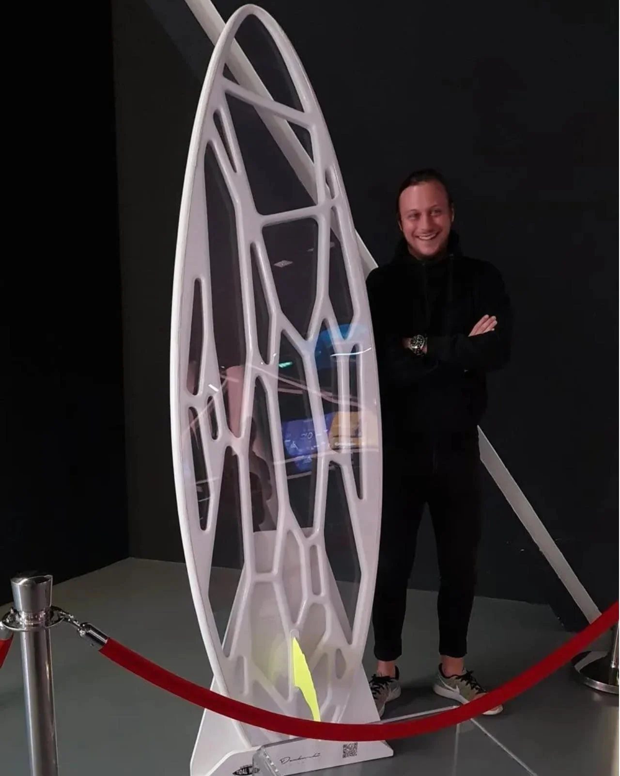
Designer Igor Dzukovski's Tidal Wave prototype pairs a carbon-fiber lattice with clear panels, letting surfers look through the board at the water below.
Sightseeing Isn't What Surfboards Are Built For
Most surfboards are designed to do one thing well: ride waves. The surface you stand or lie on is a tool for performance, and whatever you see of the ocean is a side effect. Tidal Wave, an experimental prototype from designer Igor Dzukovski, flips that priority. Here, the view from the board is the point.
That's a small shift on paper, but it asks the board to do a job it was never really asked to do. Think about how a surfboard usually gets judged: rocker, rail shape, outline, how cleanly it turns off the lip. Vision almost never makes the list. Tidal Wave puts it at the top, and that's what makes it worth a closer look, even if you end up skeptical of the result.
The designer behind the project is Igor Dzukovski, and his project page is the most direct source for what he's trying to do. I'd read it before any secondhand coverage, including this piece. Designers usually describe their intent more carefully than the press repeats it, and the gap between the two is where the useful questions live.
A Pool Reflection Started It
The idea didn't come from a big wave or a near miss. Dzukovski noticed sunlight dancing on the water in a swimming pool one morning and wondered whether a board could carry that effect. His project page describes the question he asked next: rather than printing reflections onto the surface as a graphic, how could the materials and structure themselves create that shimmer?
That's a humble origin for a board. Most performance-driven designs start with a problem a surfer has in the water, like poor paddling efficiency or a board that loses hold on steep faces. Starting from a pool on a quiet morning tells you the goal was visual curiosity first, and everything else came after.
Here's the thing: a pool is a forgiving place to notice light. It's flat, shallow, and clean compared to open ocean, where swell, wind chop, and churned-up sand break any pattern apart. Carrying that effect onto a board that spends its life in messy water is a real translation problem, and it's the part I'd watch most closely.
That origin matters. The transparency reads as a direct answer to the original observation, not a gimmick bolted onto a standard shape. I'd argue it also explains why the project feels more like an art piece than a product. The idea came first and the engineering followed. That said, the order doesn't make the idea less serious.
Clear Panels, Visible Lattice
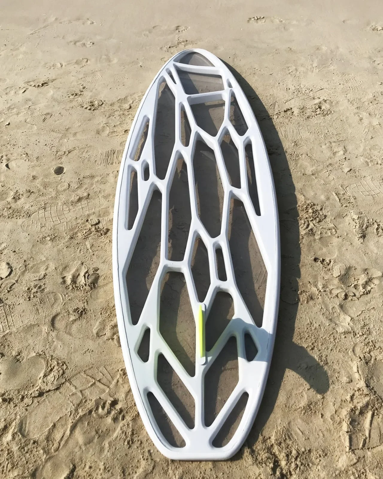
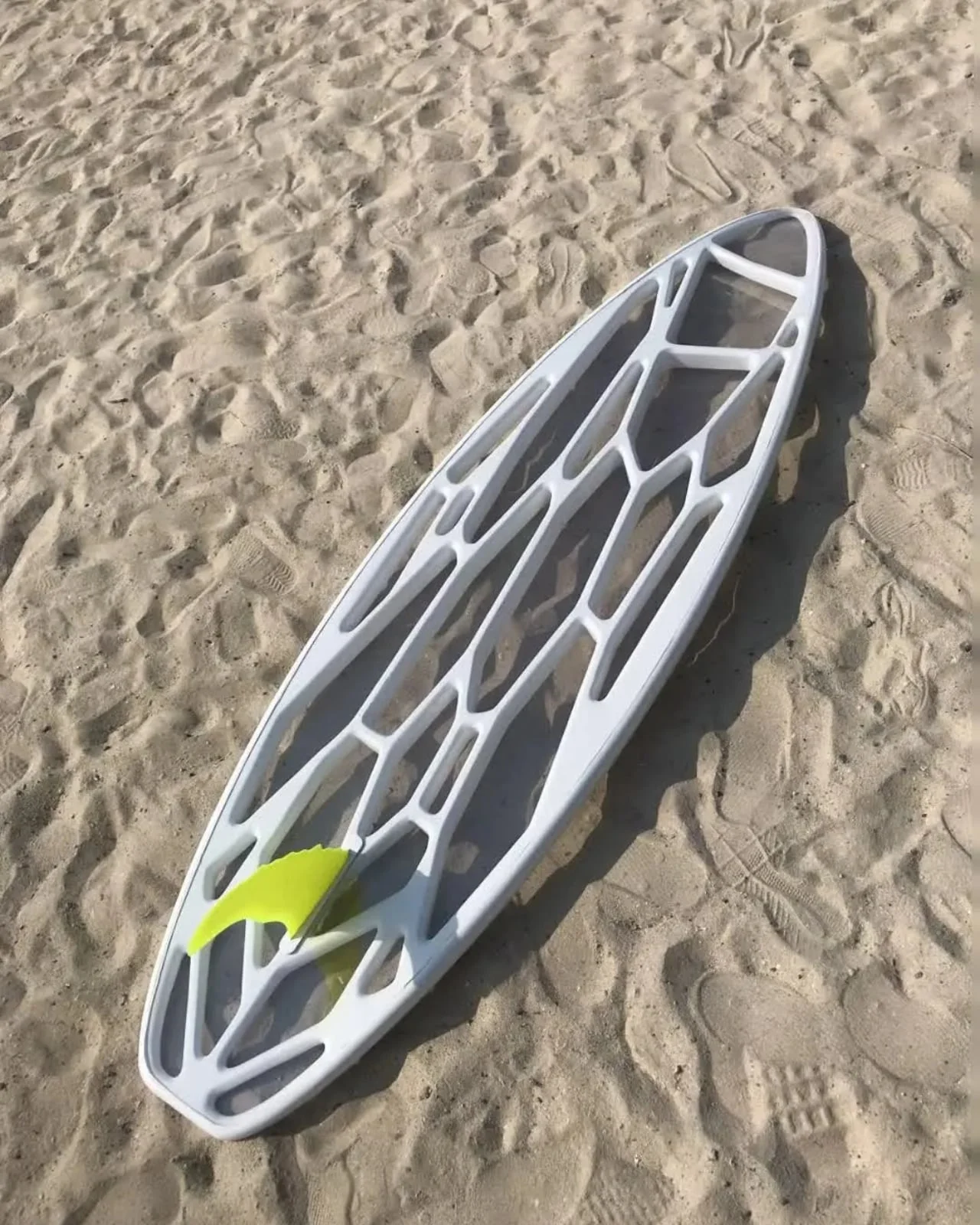
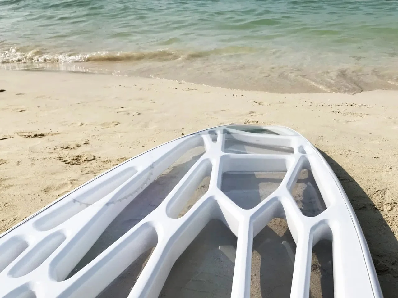
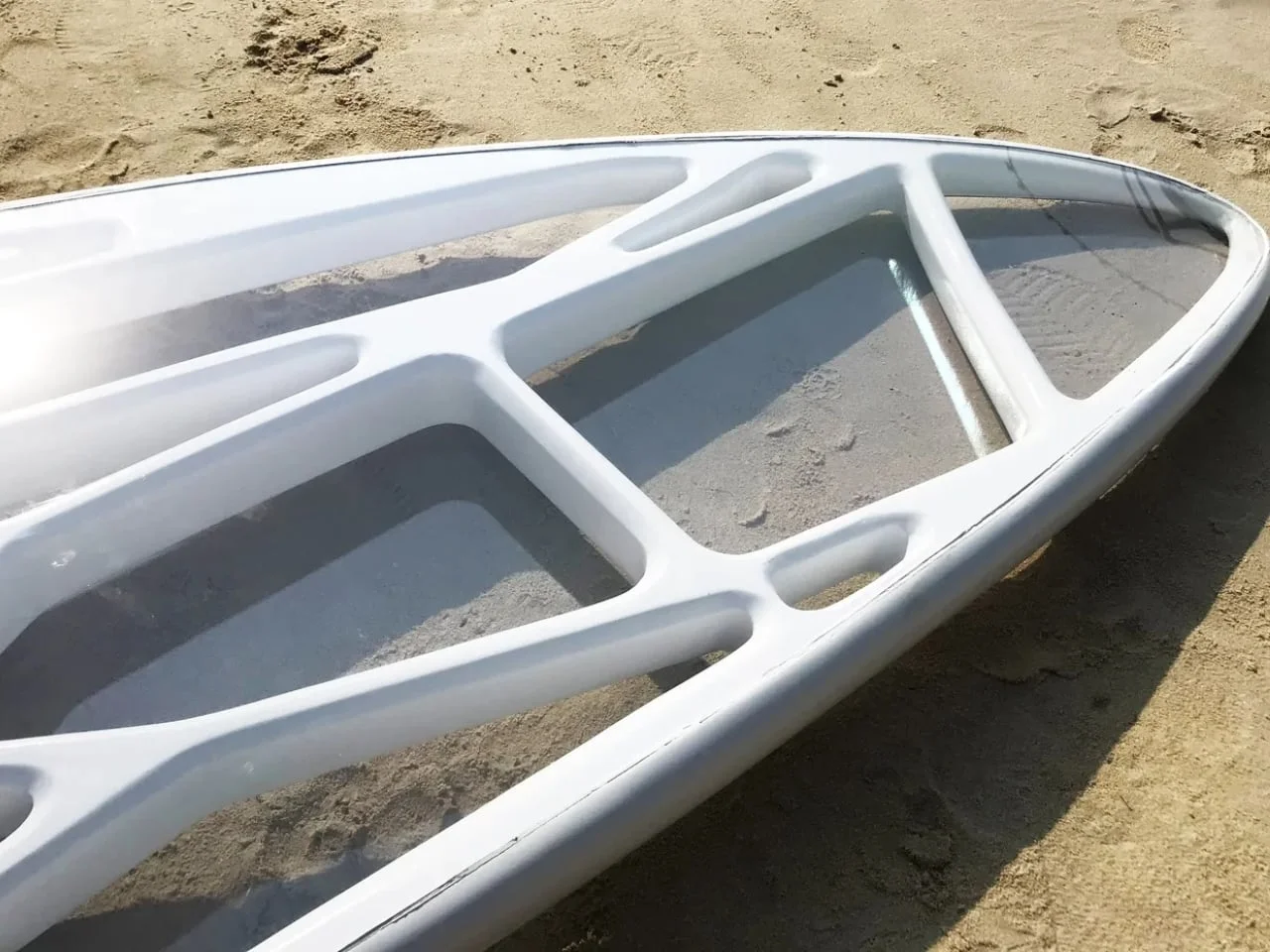
The board uses what Dzukovski calls a transparent "sandwich" construction. A white-finished carbon-fiber framework wraps clear panels, and the whole thing is meant to let you see plants and animals beneath the surface. The environment does most of the decorating. The same board looks different resting on sand, floating in sunlit shallows, or sitting over darker water, because the setting is what fills the clear areas.
Sandwich construction is a familiar approach in composite work generally: a core held between outer skins, giving strength without adding much weight. What's unusual here is swapping an opaque skin for clear panels. Transparent materials in other applications often raise questions about UV exposure, scratching, and how they age under repeated stress. Those are the questions I'd put to this board first, because a surfboard takes more abuse than most things made of similar materials.
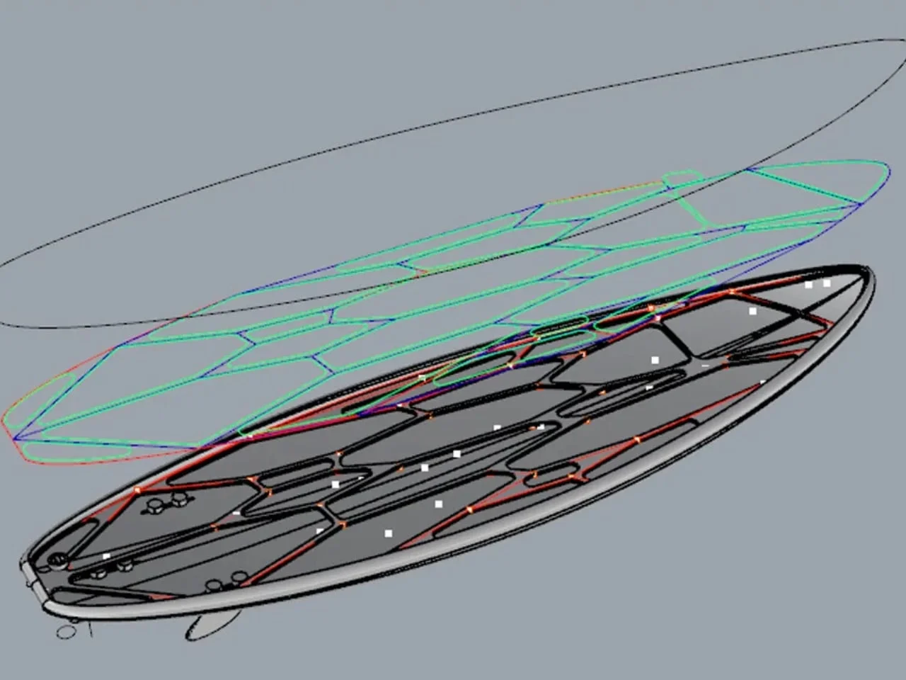
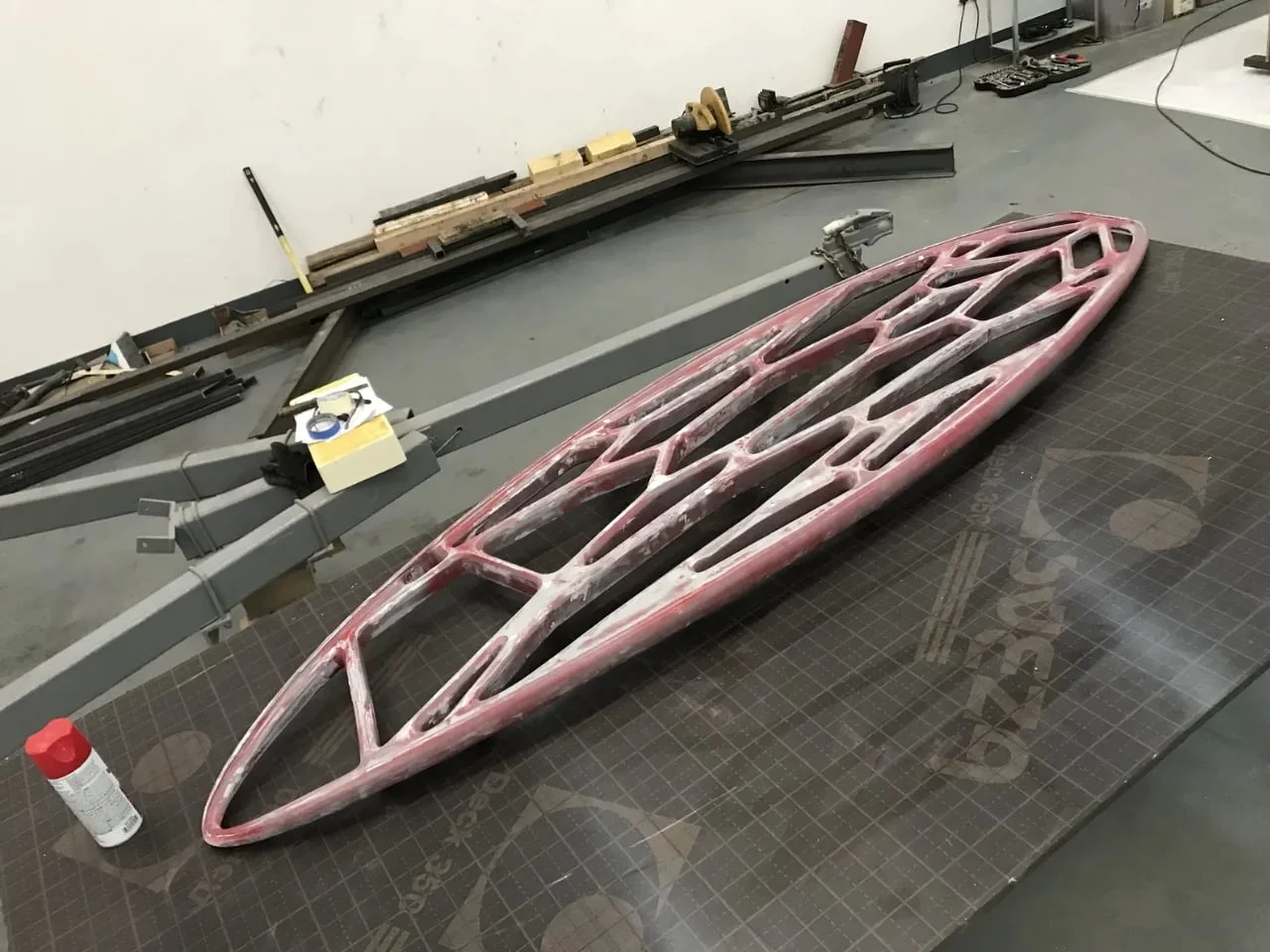
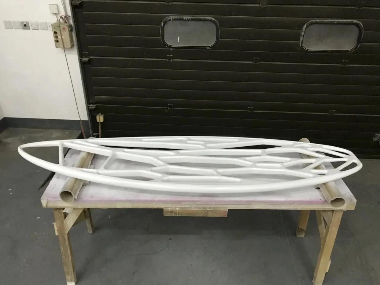
Leaving the framework exposed is the more interesting choice. Designboom describes the carbon-fiber ribs as fluid and organic, framing the clear sections instead of vanishing behind an opaque skin. My read is that the structure becomes the decoration. The lines dividing the transparent areas carry the visual identity, so the board doesn't need a busy graphic to hold your attention.
And this is the part most people overlook: a visible frame also leaves nothing to hide. A conventional board can absorb a sloppy seam under paint or resin. Here, every joint between the lattice and the panels is part of the look, so the build quality has to be right in a way it doesn't have to be on a painted deck. That's a stricter standard, and it's a fair one for a design this exposed.
Where Paddling Meets Looking
For a surfer who treats the ocean as more than a wave-delivery system, the appeal is easy to see. Paddling out and waiting between sets are the stretches where most of the water time happens, and they're usually the quiet parts of a session. A window in the board could turn those minutes into something to watch.
If you've spent a lot of time lying on a board, you already know how much of that time is spent staring at nothing in particular. Sea life, color changes in the sand, the shape of a reef below you: most of that gets missed because your eyes are fixed on the horizon or the next set. A transparent deck would give you a reason to look down, which is a small but real change in how a session feels.
Conditions would decide how often that works. Water clarity, light, surface glare, and your body position would all shape what you can actually see. When lying down, your own body would block part of the clear area. Still, on a clean, sunlit day, the chance of spotting something below you adds a layer that a solid board can't offer.
A Concept, Not Yet a Product
A pretty framework doesn't prove a good board. Nothing public so far addresses how the completed Tidal Wave handles, how comfortable it is to paddle, or how well its clear surfaces hold up after months of salt, sand, and impact. Those are the questions that matter for anyone weighing a first board, and they're the ones I'd want answered before calling this a serious alternative to a conventional shape.
The project page explains the intended experience but gives no retail price or ordering details. That makes Tidal Wave a design statement more than a purchase option, at least for now. If you're hoping to buy one, you'll be waiting on information the designer hasn't published.
And yet, that's arguably the point. Tidal Wave asks what a surfboard could let you notice, and it treats the water beneath as part of the ride rather than scenery behind it. That's a question worth taking seriously, even if the answer stays on the drawing board for a while.
What Comes Next for Visual Design in Surfing
The bigger signal here isn't the board itself. It's the willingness to treat a surfboard as a place for visual experimentation rather than a fixed performance object. Surfboard design has long been driven by incremental gains in speed, hold, and turning. A project that starts from light on a pool wall pushes in a different direction, and that's worth watching even if this specific prototype never ships.
What would change my mind is evidence from actual use. A transparent deck that survives a season of real sessions, keeps its clarity, and paddles as well as a conventional board would be a meaningful step. One that looks striking in renders but scratches badly or feels awkward in the water would be a footnote. If you're working in board design or materials, that's the test to focus on, not the photos.
Here's what I'd tell a peer: judge the idea on its own terms, and hold the execution to a higher bar. The concept is more interesting than most surfboard news, and the open questions are exactly the ones that decide whether an idea like this changes how people ride.



Discussion
Sign in to join the discussion.