Tiffany Blue re-emerges as a stylish fall color, infusing spaces with elegance and warmth, pairing beautifully with seasonal hues.
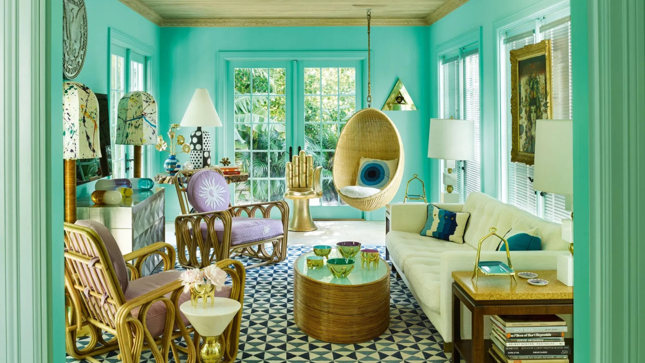
The Tiffany Blue Phenomenon
As summer wanes, New Yorkers have embraced a shift not only in temperature but also in color. This past month, the vibrant hues of teal and turquoise have become particularly prominent, with Tiffany Blue leading the charge. This captivating and easily recognizable shade seems to have found new life as the season changes. But will this trend endure as autumn rolls in? From the looks of it, the answer is a resounding yes, especially within fashion and home decor.
A Timeless Color for Modern Spaces
In the realm of interior design, Tiffany Blue isn't merely a seasonal choice; it's emerging as a standout color that enhances the traditional palette associated with fall. Designer Prudence Bailey emphasizes its unique appeal, associating the color with optimism, nostalgia, and a distinct sense of luxury. It strikes a perfect balance, pairing well with rich textures like velvet and mohair, creating a sophisticated and cozy atmosphere for the cooler months ahead.
What's particularly fascinating is that Bailey has observed a growing appetite for color among consumers who've been inundated with a sea of neutral tones in recent years. A flood of grays, whites, and beiges has left many craving something more vibrant. Tiffany Blue provides that refreshing burst of color while maintaining an elegant aesthetic. After all, it’s an hue closely linked to the taste and refinement of Tiffany & Co., a brand that has long symbolized luxury.
Versatility in Design
The versatility of Tiffany Blue makes it a cherished choice across various design elements. For instance, consider the stunning Le Creuset’s new ‘Riviera’ Dutch oven, which brings that delightful blue into everyday cooking. This kitchen staple not only adds a pop of color but also blends seamlessly into various kitchen styles. Similarly, the luxurious dinnerware from Ginori 1735, with its hand-painted gold edges, elevates dining experiences—making every meal feel special.
Plus, the plush touches provided by items like Soho Home’s velvet cushions further amplify the blue's prominence in living areas. These pieces don’t just serve aesthetic purposes; they also bring comfort and warmth, perfect for the cozier settings of fall.
Expert Insights on Seasonal Pairings
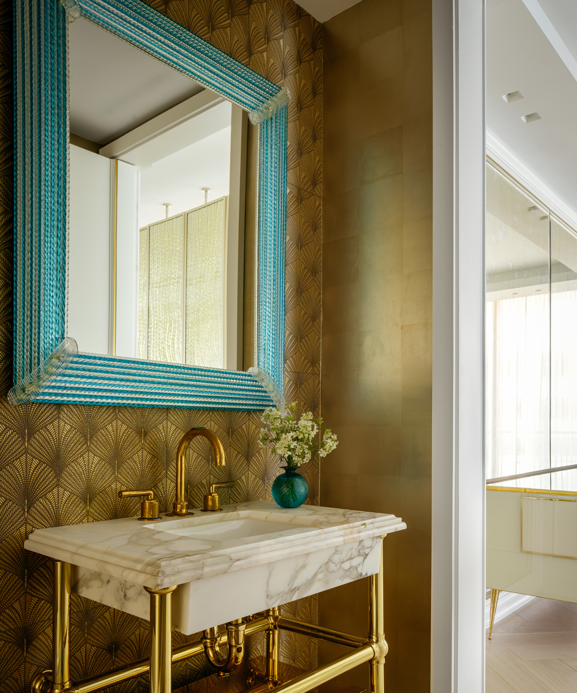
Designer Benjamin Brougham from the Jonathan Adler Design Studio offers insightful advice on combining Tiffany Blue with classic fall colors like deep olive, mustard, or maroon. These tones work beautifully together, creating a depth that adds richness to a space. There’s something to be said for the striking contrast Tiffany Blue provides, turning a simple color palette into a vibrant seasonal display.
Interestingly, Brougham's team has even taken this concept a step further by saturating an entire kitchen in turquoise. They've transformed a typical cooking area into a 'jewel box', adorned with antique mirrors and brass fixtures. This bold move makes a statement and highlights how Tiffany Blue can transform a mundane space into a radiant experience.
Seasonal Appeal: A Unique Addition
As autumn approaches, it’s hard to overlook how Tiffany Blue stands apart from the rich ruby reds, golden yellows, and deep emeralds that typically dominate the seasonal color wheel. The hue adds a fresh and modern touch, promising to bring both life and sophistication to fashion trends and home decor alike. If you're working in this space, integrating this color may just be the most strategic choice this fall.
Affordability Meets Style
For anyone looking to update their living spaces without incurring major expenses, there are numerous options that are accessible, with finds often priced under what you'd spend on a simple accessory, like a tennis bracelet. This affordability makes it easier to embrace the seasonal shift without breaking the bank.
Implications for the Future
What this means for retailers is significant. There's a clear trend towards incorporating bold colors into product lines, and Tiffany Blue is positioned at the forefront. As consumers continue to seek out variety beyond the monochromatic palettes of previous seasons, expect to see more brands adopting this color in various forms. With its versatility and deep-rooted associations with luxury, Tiffany Blue isn't just a fad; it’s a testament to the enduring power of color in design.
And this is the part most people overlook: color can influence mood and perception, extending beyond aesthetics to impact our emotions in daily life. As we engage more with our surroundings, it’s this understanding of color's emotional resonance that will likely drive demand for striking palettes like Tiffany Blue, fostering a rich interplay between design and lifestyle.

Discussion
Sign in to join the discussion.