Joa Studholme offers ten essential lessons on using color in home decor, emphasizing comfort, warmth, and personal expression.
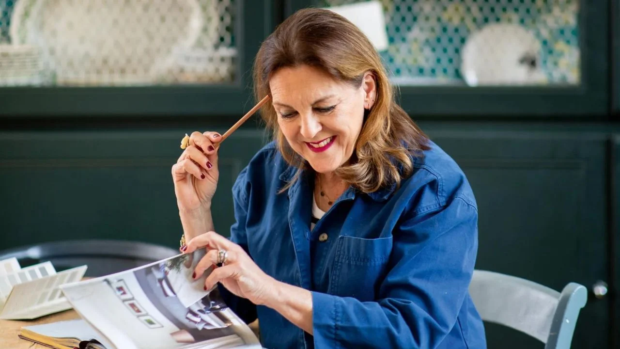
Color isn't just a decoration; it can dramatically alter the essence of a room. Joa Studholme, a key figure at the esteemed paint brand Farrow & Ball, distills her decades of experience into foundational ideas for creating atmospheres that resonate with personal comfort and warmth. Her message is refreshingly straightforward: trust your instincts, celebrate the hues you love, and prioritize a living environment that feels right to you.
Personal Comfort as a Starting Point
For Joa, the journey to a successful color palette begins with a fundamental question: "What do you feel comfortable with?" Rather than adhering to fleeting trends or neighborly influence, she suggests focusing on what genuinely resonates. A visit to someone's home often reveals their aesthetic preferences even before stepping inside—often indicated by the colors of their garden gate or front door.
Memories tied to specific colors can also play a significant role; this could be a shade that reminds you of childhood or a beloved holiday setting. If you're unsure which colors resonate, look back at the images you tend to save or share. Joa recommends platforms like Pinterest, pointing out that even if the images include predominantly white rooms, what stands out is the ambiance they convey.
Shifting Towards Warmer Neutrals
There's a perceptible shift happening in interior design, moving away from cooler neutrals toward warmer, more complex color options. Joa observes that earlier design favorites were often grey or stony. However, today’s popular neutrals, such as Stirabout and Jitney, evoke warmth and richness. For example, Jitney's uplifting nature finds its inspiration in the joyful experiences of summer trips to the Hamptons.
Warm neutrals work because they don't dominate the space; rather, they allow other elements to shine. Joa's own favorite, Au Lait, exemplifies this quality with its friendly, muted tone that adapts effortlessly to various settings.
Dynamic Lighting and Color Transitions
Joa advocates for a harmonious transition from light spaces during the day to darker, more enveloping areas as evening falls. This dynamic shift not only enhances functionality but also delivers an emotional uplift—“It's really good for the soul,” she states. For instance, a bright kitchen can lend energy, while a cozy, darker living room invites comfort as the day ends.
The sequence she recommends includes Scallop in the hallway, Dead Salmon in the sitting room, and lighter shades, like Au Lait, in kitchens or woodwork.
Redefining Flow and Color Identity
A common concern among homeowners revolves around the concept of "flow"—the visual continuity between rooms. Joa's perspective on this is liberating; she emphasizes that flow doesn’t necessitate a single palette throughout the house. Individual rooms can express unique identities based on personal needs and functions. She believes in maintaining a similar weight of color intensity across spaces to achieve a coherent look, even if the colors differ entirely.
Delightful Surprises in Color Application
A playful approach to color can invigorate any space. Joa enjoys adding unexpected elements, such as painting a door jamb in a contrasting color for a minor yet impactful visual surprise. This technique offers a fleeting excitement akin to a stylish accessory, while more comprehensive designs, like multi-colored door frames or checked wallpaper, can create a cohesive yet surprising aesthetic. Her philosophy asserts that subtle, well-executed decorations should not draw attention but rather contribute to the overall harmony of a room.
Reimagining Ceilings as Creative Canvases
Joa suggests rethinking the role of ceilings in home decor. She regards them as the "fifth wall"—a crucial part of the design that should complement the surrounding colors rather than defaulting to a drab white. One of her preferred ideas is to use a reflective gloss finish, which enhances light in a darker room. "You walk into the room, and you don't think, 'Oh God, the ceiling is pink and glossy.' You just think it feels really nice,” she describes.
The Beauty in Color Variability
An intriguing aspect of paint is how colors change in different lighting conditions. Joa sees this variability as a feature, not a flaw. Rather than fearing that a color may appear inconsistent at home, she suggests embracing its dynamism, noting that good color should feel "alive." Her favorite shade, Light Blue, illustrates this concept beautifully, transitioning between refreshing silvery tones during the day and softer greys at night.
Exploring Finishes as a Layer of Color
Joa’s fascination extends to the interplay of different paint finishes. She appreciates the chalky quality of Dead Flat paint, which provides depth, while gloss offers durability and reflection. Using them in conjunction—such as pairing a gloss finish on lower wall portions with Dead Flat above—can create visual intrigue and offer functional advantages in high-traffic areas.
Gentle Introductions to Color
Despite her vibrant approach to color, Joa understands some individuals may prefer a more subdued setting. She encourages those cautious about color to experiment in smaller doses. Children's rooms, for example, provide an opportunity to use bold colors in a contained manner, allowing personal expression without overwhelming the overall decor.
Embracing Diverse Color Preferences
Ultimately, Joa believes that personal taste should reign supreme in color selections. While she may find certain colors, like lilac, challenging, she appreciates the unique preferences of each individual, asserting, "Isn’t it lucky we all like different colors?" Currently, she gravitates toward a richer palette, favoring shades such as Etruscan Red and Duster which evoke warmth and grounding sensations.
The overarching theme of Joa’s decorating philosophy is fairly simple yet profoundly impactful: choose colors that bring joy and ensure that your home feels like a true reflection of yourself. After all, the goal is to cultivate a space that nurtures and embraces rather than confines or restricts.
To discover more from Joa and the insights shared at the Livingetc Unlocked event, visit our hub or register your interest for next year's event.



Discussion
Sign in to join the discussion.