Sherwin-Williams selects a fresh, pale green shade named Celery SW 6421 as its Color of the Year for 2027, offering a new perspective on green hues.
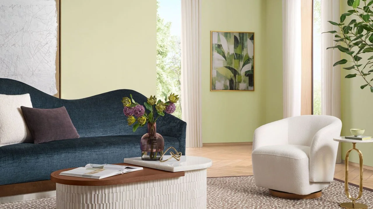
As the Color of the Year season unfolds, Sherwin-Williams has announced Celery SW 6421, a pale green that promises not just to refresh interiors but to redefine how we perceive color in our living spaces come 2027.
Celery: A Fresh Perspective
With its light, bright tone complemented by hints of yellow, Celery stands apart from the earthy greens that have dominated recent trends. Brands like Dulux have embraced paler shades, like their Soulful Sage, while Behr has opted for the darker and moodier aesthetic with Grounded. These choices are certainly popular for their grounding effects but can leave a room feeling heavy. Unlike these more muted colors, Celery's vibrancy presents a lively alternative. 'Celery brings a new energy to the color palette for 2027,' states Ashley Banbury, Sherwin-Williams Color Marketing Manager. 'This soft yellow-green is uplifting yet effortlessly livable, capable of infusing spaces with a gentle touch of color without overwhelming brightness.'
The Comforting Spectrum of Green
Though sage greens are often used to ground a design, the freshness of Celery proves equally soothing. The psychological impact of color cannot be overstated; green is widely regarded as a color that embodies tranquility and connection to nature. 'Green is comfortingly familiar, reflecting the natural world we inhabit,' Ashley notes. 'It enriches a living space, offering a grounding essence without sacrificing approachability.'
Her insights illuminate the expansive spectrum within green shades, which can range from rich, deep forest tones to lighter, more uplifting options like Celery. This fluidity allows homeowners to adopt green in ways that align with personal decor aesthetics and promote a connection to the outdoors. The emotional response tied to these colors often dictates how they are used, influencing everything from paint choices to furniture decisions.
Exploring Celery’s Versatility
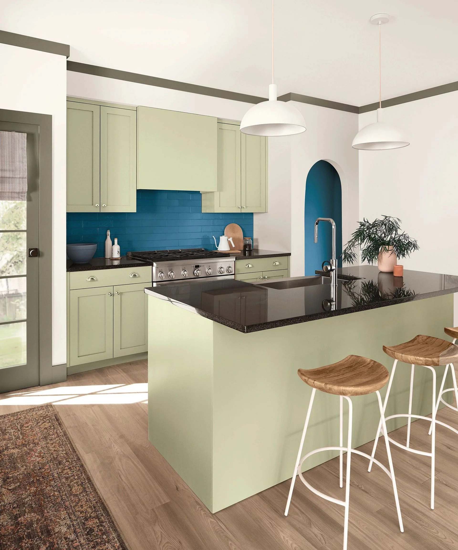
Celery’s unique quality lies in its sunny undertones, granting it a vibrance that typical olive and sage shades lack. This makes it suitable for brightening spaces in need of a lively touch. Yet, its adaptability allows it to anchor an earthy palette as well. 'Celery balances beautifully with breathable neutrals like White Flour SW 7102 and Woven Wicker SW 9104 for a serene aesthetic,' Ashley adds. Mixing colors is an art, and Celery opens up numerous possibilities.
To pair deeper hues effectively, earthy tones like Artichoke SW 6179 and Cocoon SW 6173 underscore Celery's natural roots, while a vibrant contrast can be seen with shades like Georgian Bay SW 6509. Here's the thing: meticulous color matching might involve more than personal preference. It also reflects current trends in home aesthetics.
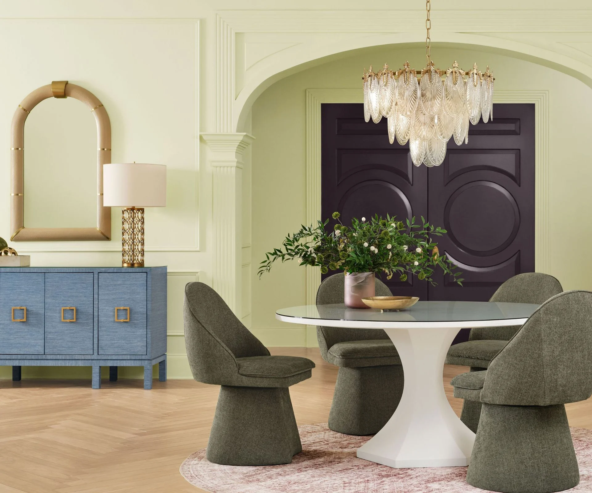
Whether minimalistic or bold, you can adapt your palette with Celery. 'Amp up the expression with hues like Kirsch Red SW 6313 or Plum Brown SW 6272 for a sophisticated touch, or opt for muted pops like Potentially Purple SW 6821 and Cosmos SW 6528,' Ashley advises. 'Celery provides a fresh canvas for versatile styling.' You can see how these color combinations play out in various settings, enhancing both modern and traditional designs.
More than Just Color: A Symbolism
'Celery underscores our everlasting bond with nature while also indicating a shift in how we define nature-inspired colors,' Ashley reflects. The color serves as a reminder of greenery amidst an age dominated by technology. 'We're gravitating toward shades that evoke comfort and rejuvenation yet inject a sense of freshness and personality into our spaces. It's all about creating environments that feel genuine and resonate with everyday life.'
Choosing calming shades like Celery can enhance tranquility in your home. 'This color embodies calmness while infusing a sense of renewal and energy,' she says. It's interesting to see how color preferences align with societal sentiments, especially in challenging times. People often seek refuge in their living spaces, making color choices essential for promoting well-being.
Designed to harmonize across varying styles, from modern to vintage, Celery is versatile enough to complement a variety of furnishings and textures. That's the beauty of this shade; it adapts easily, offering homeowners a chance to creatively express themselves while maintaining comfort.
The Celery Shopping Edit
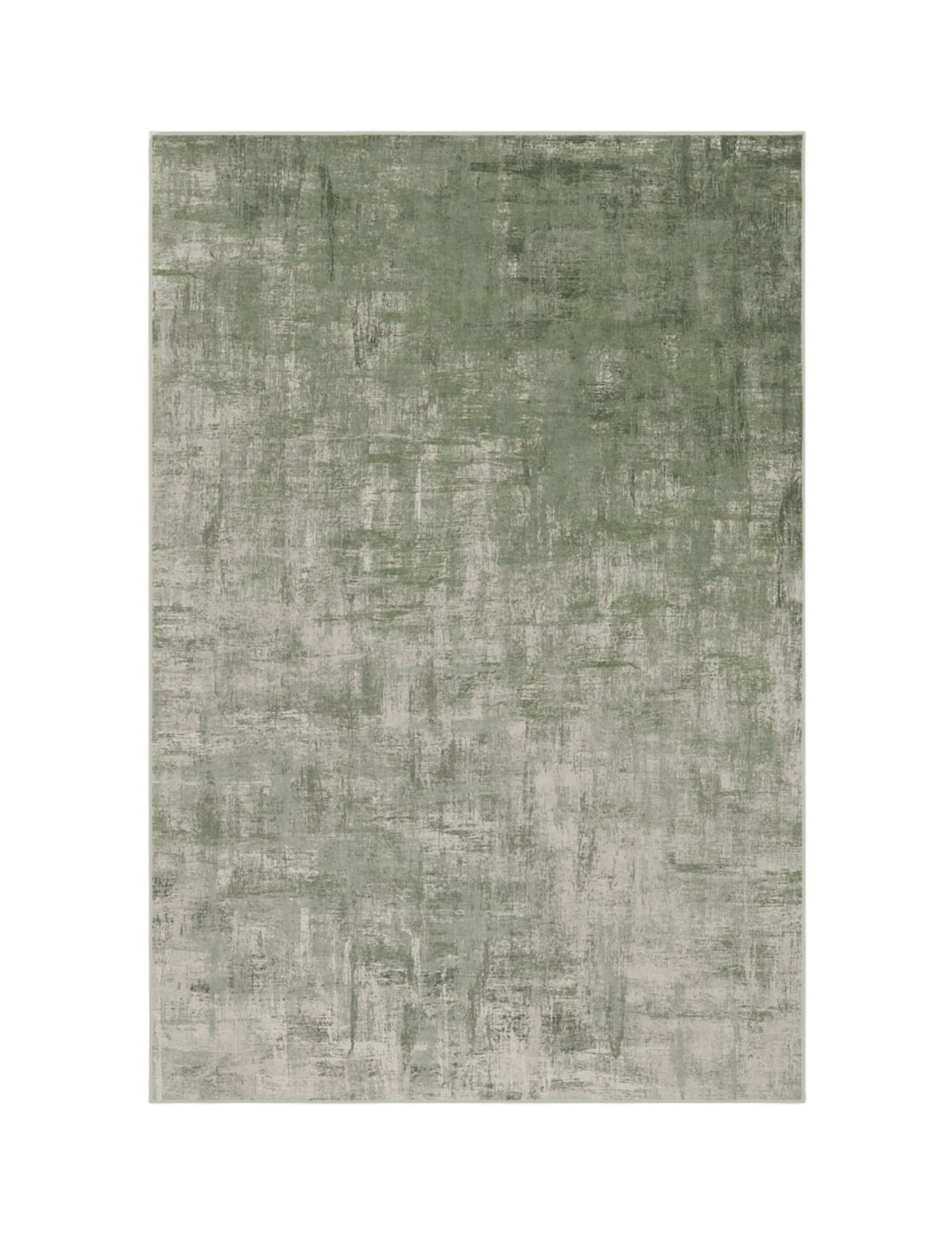
Sherwin-Williams' selection is both refreshing and adaptable. It strikes a balance, inviting exploration in design while enhancing the comfort and livability of any space. If you're working in this space, considering shades like Celery could certainly inspire a new approach to your interior designs.
Looking Ahead: Implications for Home Design
The choice of colors in home design is more than mere aesthetics; it reflects psychological and emotional undercurrents. Celery, with its soft vibrancy, may signal a collective longing for connection to nature as urban settings become increasingly frenetic. Those who choose to embrace it might find themselves creating environments that promote well-being, reflect contemporary tastes, and encourage a sense of tranquility. This isn't just about color; it’s about how color choices can influence our lives.
As we await more trends and shifts, the emergence of shades like Celery indicates a continuing evolution in how we decorate our homes. For those who care about design, this could be the beginning of a wave of fresh ideas that prioritize both personal comfort and stylistic expression. For more design tips, inspiration, and expert advice on decor trends, consider signing up for our newsletter.



Discussion
Sign in to join the discussion.