Little Greene unveils 27 new paint shades that blend historical influences with contemporary trends, offering warmth and versatility for modern interiors.
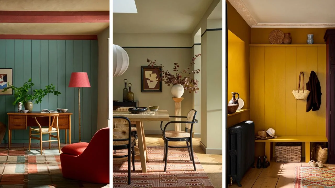
Little Greene has expanded its palette with 27 new paint colors that reflect a balance between historical resonance and modern aesthetics. Each shade, while distinct, fits into the larger narrative of color trends that have evolved over time, offering options that provide both comfort and style. This release is more than just a variety of colors; it's a calculated approach to meet the nuanced demands of contemporary design sensibilities.
Overview of New Paint Colors
These new shades fall within the Colors of England and Color Scales collections, showcasing hues ranging from earthy ochres to rich teal greens. They are designed to evoke warmth and a sense of contentment in any space, resonating with current trends while paying homage to enduring palettes. It’s clear Little Greene recognizes that today’s consumers are increasingly looking for colors that do more than merely decorate—they want colors that tell a story or evoke a mood.
Evolution of Color Trends
Ruth Mottershead, Little Greene’s Creative Director, explains that color trends have seen an evolution rather than abrupt shifts. “In recent years, we’ve observed a movement that started with bold blues, transitioned into softer greens, and then into deeper ochres and browns,” she explains. It’s revealing that these trends have not just appeared out of thin air but align closely with the psychological effects color can have on living spaces. “Nowadays, consumers seem to be seeking a balance, with neutrals ideally sitting at a midpoint—neither too warm nor too cool.” This sentiment reflects a growing awareness that color isn’t just an aesthetic choice; it’s integral to how spaces make us feel.
New Additions to the Colors of England Collection
The Colors of England collection features six new shades, including Ashes of Marigold, a muted orange that recalls the vibrant hues of the 1970s. “This color reflects a shift from the brighter oranges of yesteryears toward softer, more grounded terracotta tones,” says Mottershead. This speaks to a nostalgia many consumers have, craving the familiar warmth of past decades while avoiding the over-saturation that some brighter shades offer.
Another notable addition is Perpetual Blue, which draws from Winston Churchill's personal palette. According to Mottershead, its deep blue tone, laced with green, alters wonderfully under varying light. This subtly shifting quality makes it an intriguing option for designers and homeowners alike. She envisions it adding elegance in spaces like a study or as a striking accent against softer tones. Colors like this tell a story, reflecting deep historical emotion while maintaining relevance in modern aesthetics.
For a fresh take on neutrals, Little Greene introduces Parlour, a delicate pink hue inspired by the parlour at Dyrham Park. “There’s a growing desire for pastel shades that evoke joy without casting a heavy presence in a room,” Mottershead notes. And this is the part most people overlook: how pastel shades can enliven spaces without overpowering them. In an era of minimalism, subtler colors help create environments that are both breathable and inviting.
Exploring the Color Scales Collection
Meanwhile, the Color Scales collection unveils 21 new hues, such as the warm neutral Barge Stone, available in a range from light to dark. This shade emerged from the success of Portland Stone, reflecting a consumer trend towards more complex beiges. Complexity in neutrals allows for greater versatility in home design, as they can pair with a variety of colors and textures while still adding depth to a space.
Mottershead highlights that these new shades represent the evolution of consumer preferences. “We’ve shifted from intense caramels and burnt oranges to more gentle tones, favoring warmer shades like Celestial Blue and Hammock,” she remarks, illustrating a clear response to both lasting trends and immediate consumer desires. This shift indicates a broader understanding in the design community: consumers are gravitating towards colors that resonate with their desire for comfort and tranquility.
Significance of the New Offerings
Little Greene’s new offerings exemplify a thoughtful synthesis of current color trends and timeless choices, catering to modern homeowners who seek both aesthetic appeal and historical connection. Each hue is strategically crafted to fit within the broader context of color’s evolving narrative, revealing a blend of what we’ve cherished and what we currently embrace. But what does this mean for you, the consumer? The palette reflects a growing recognition that our living spaces can be a personal expression—influenced by history but crafted for today.
Future Outlook
As we consider Little Greene's new colors, the influence of trends in home design and consumer preferences is clear. The push towards warmer, softer shades might indicate shifting priorities as people seek refuge in their homes. With increasing attention on mental well-being and the importance of nurturing living environments, expect color choices in interior design to not just reflect trends but also an emotional landscape shifting towards solace and comfort. While major color shifts may be less frequent, the nuanced evolution within these trends suggests that companies offering a blend of nostalgia and contemporary styling are likely to thrive.



Discussion
Sign in to join the discussion.