Purple is shifting from accent color to product identity, from a Surface Pro finish to a 43-foot tiny home. Here's what that signals for design.
Purple used to mean velvet boxes, fantasy novels, and the occasional wedding palette. Lately it's showing up on game controllers, laptops, jewelry stands, and tiny homes, and that's a more interesting shift than the color itself. Designers are using purple to give ordinary objects a personality they didn't have before.
Purple Gives Ordinary Objects a Voice
Most everyday products still default to black, white, gray, beige, or brushed metal. That's a safe choice, and it's also why so many products blend together on a shelf. Purple changes the conversation without asking the object to do anything different. A speaker, a chair, a lamp, or a kettle keeps its shape and function, but a purple finish makes it impossible to overlook.
The range of purple matters as much as the color itself. Pale lavender reads as quiet and soft, while deep violet feels dramatic and a little theatrical. That flexibility lets purple work as either a subtle accent or the defining trait of a product. In crowded categories, that's a useful tool. It gives a product a visual identity before anyone reads the spec sheet.
Electronics Are Dropping the Black-and-Silver Uniform
Consumer electronics have leaned on restrained palettes for decades. Black and silver signal precision, and most buyers have come to expect them. That's exactly why a colored device stands out. Smartphones, headphones, speakers, and gaming accessories are all starting to borrow from fashion and interior design, where color is a normal part of the conversation.
Here's the thing: once a gadget becomes part of someone's personal space, it stops being only a tool. People set phones on coffee tables and leave controllers out in living rooms. Color helps those objects belong in the room, and purple does that job without looking like a novelty.
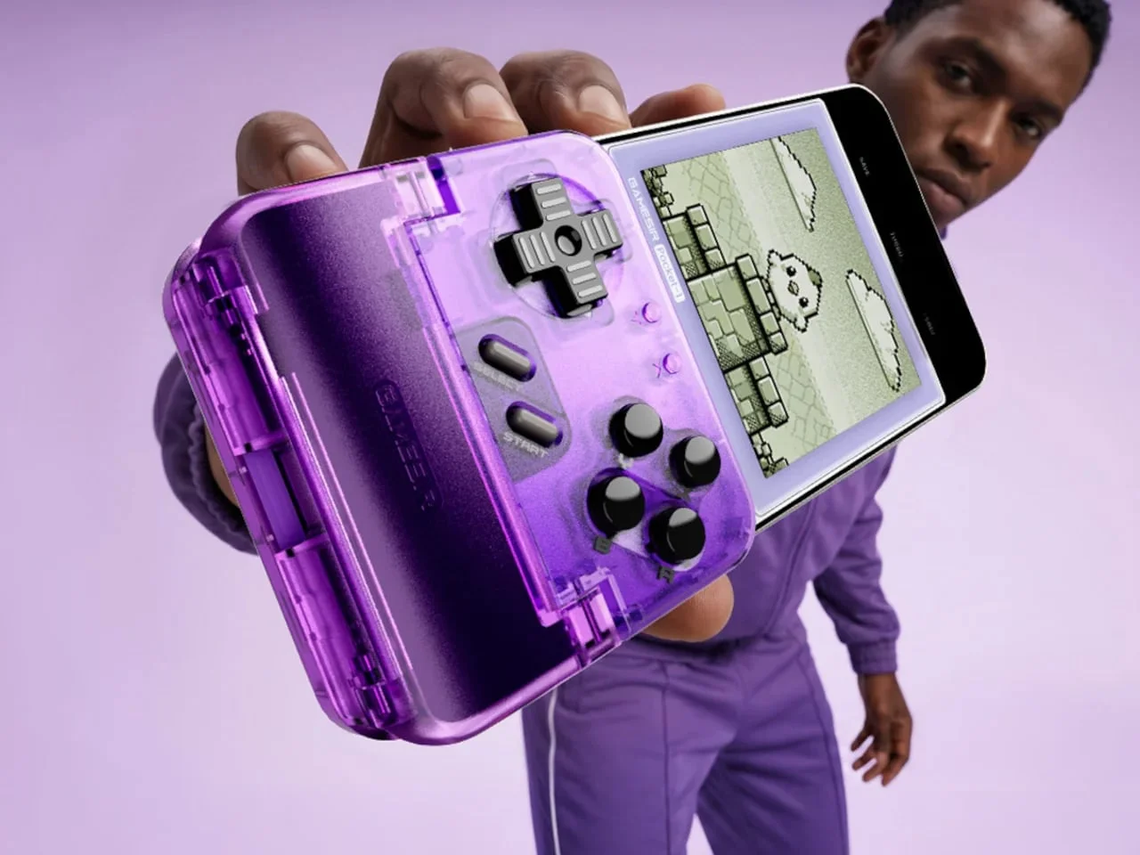
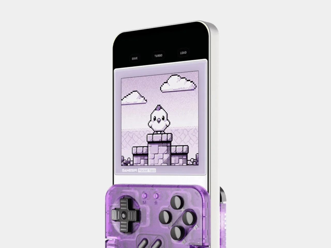
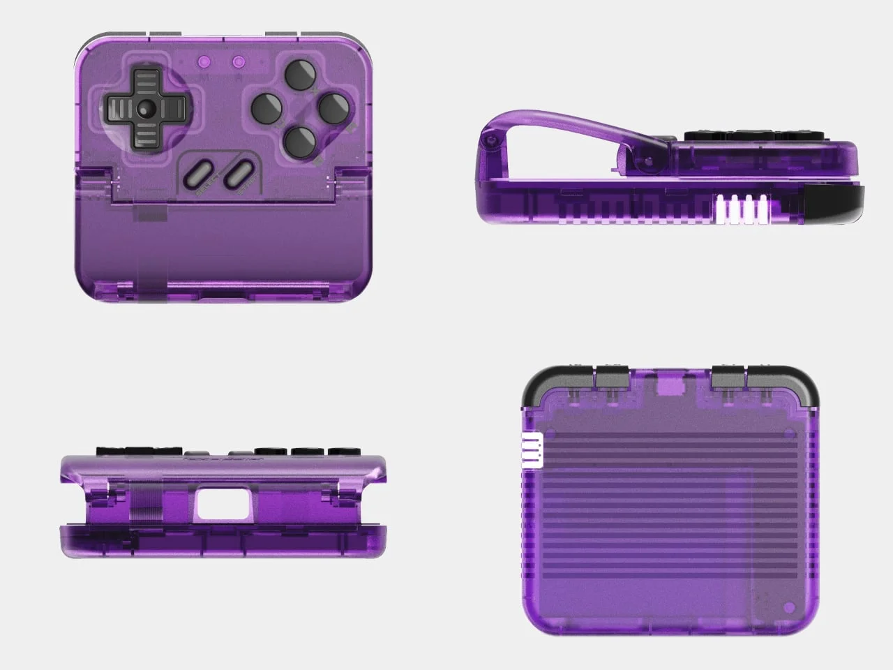
The GameSir Pocket Taco is a clear example. The controller clamps vertically around a smartphone and borrows the silhouette of classic handheld consoles, while still offering physical ABXY buttons, a D-pad, triggers, and bumpers. The original retro version came in gray. The Voltage Purple edition swaps that for a translucent purple finish, and the change makes the accessory feel playful rather than merely retro. The saturated color also shows off the compact construction, which turns a fairly understated gaming accessory into something you'd actually want to hold up in front of people.
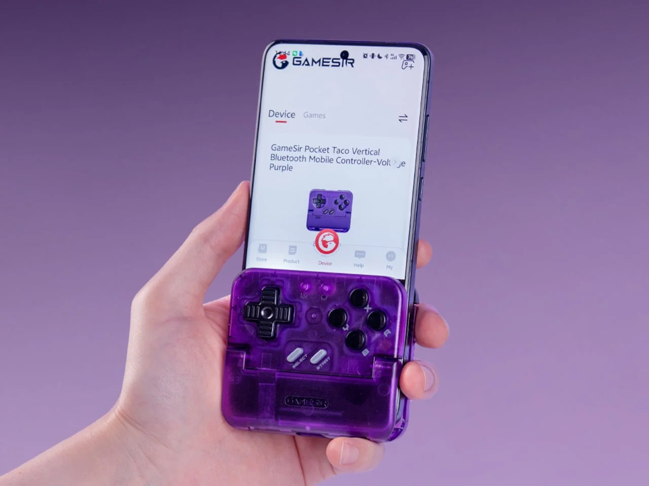
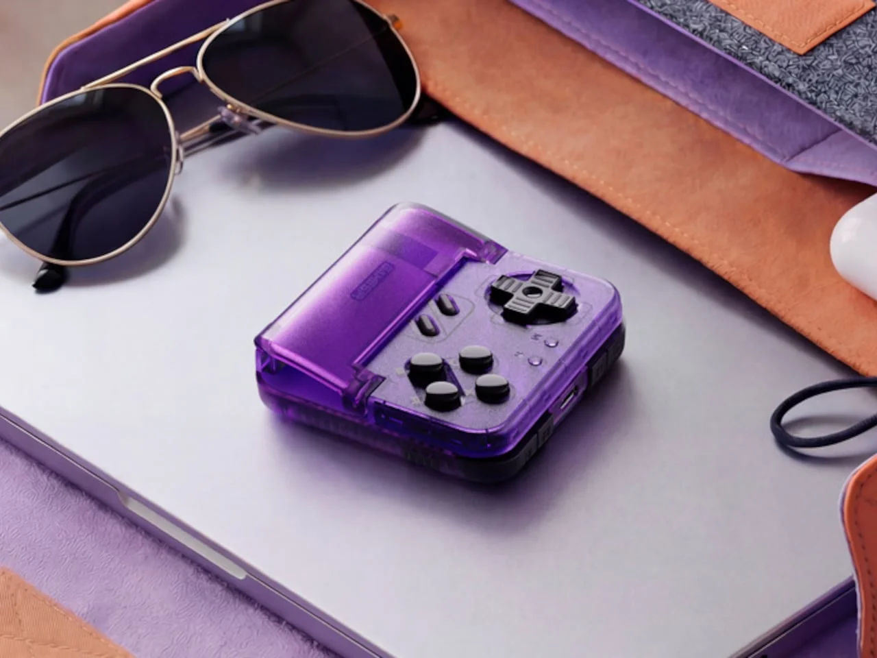
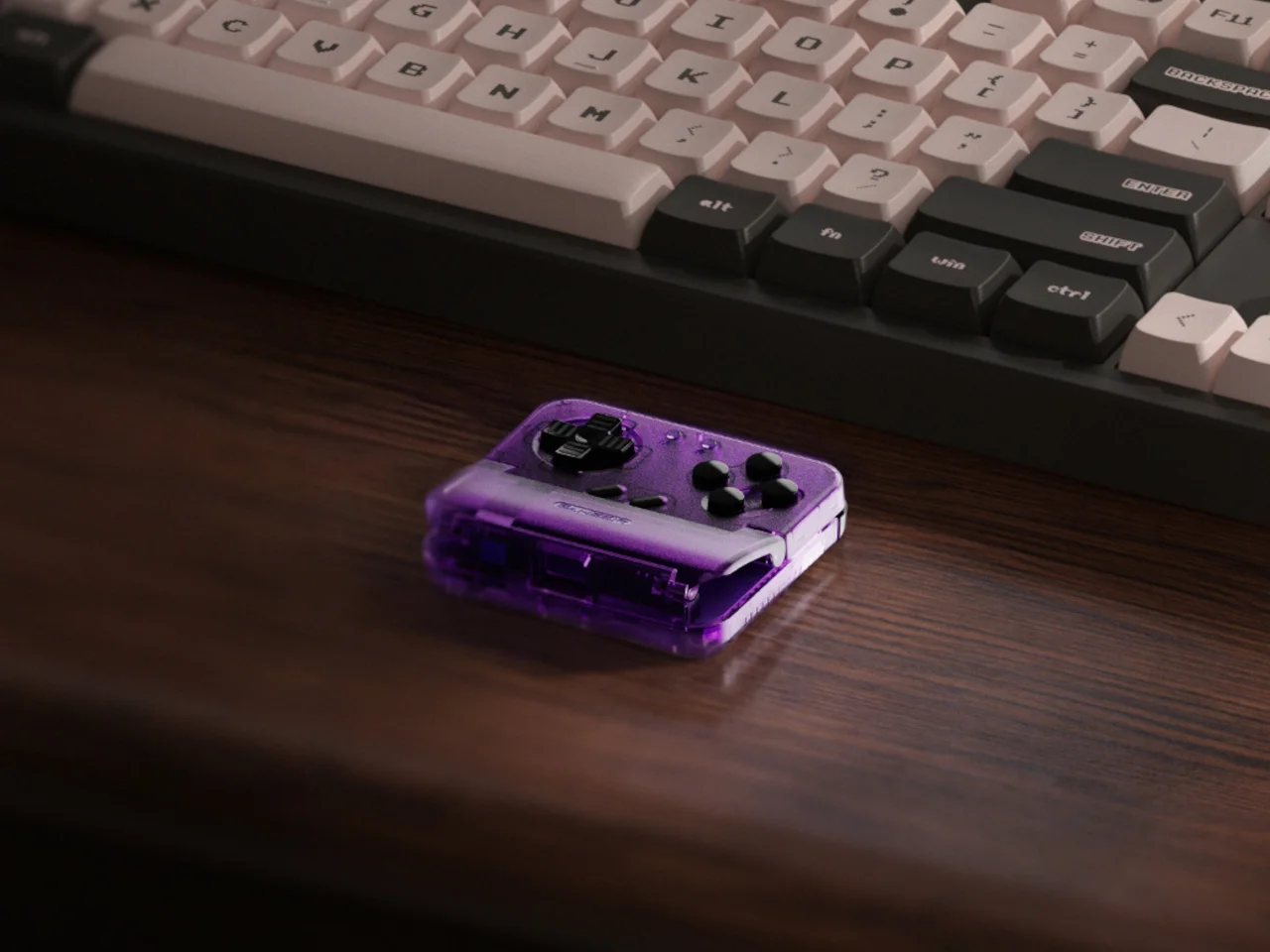
The Voltage Purple version keeps the original hardware intact. You get the same customizable controls, a 600 mAh battery, the same charging access, and compatibility with the GameSir app. That's a smart way to do it. The color is the only thing that changes, so the purchase is about personality rather than a different product. It's a cosmetic edition that still earns its place on a desk or in a bag.
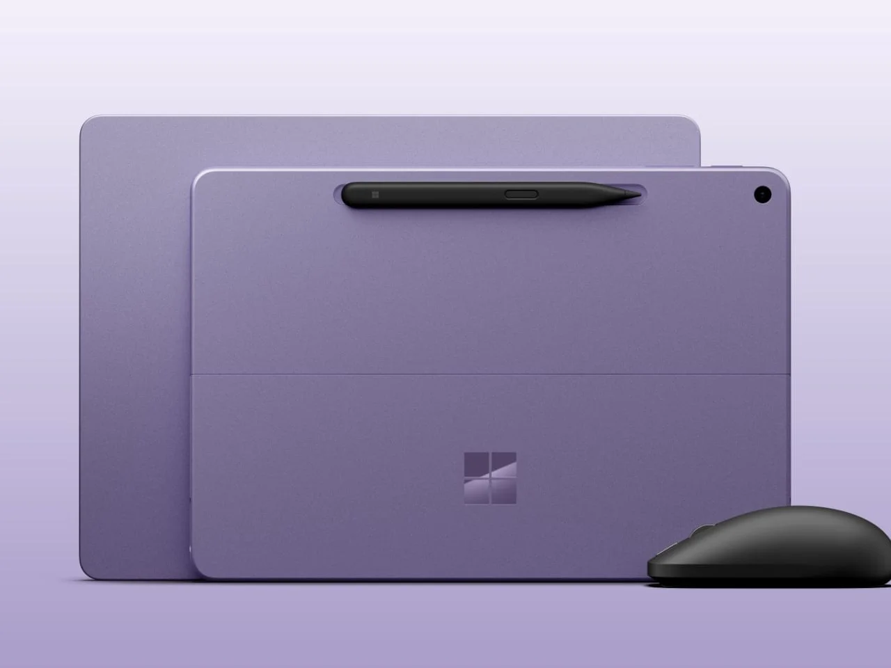
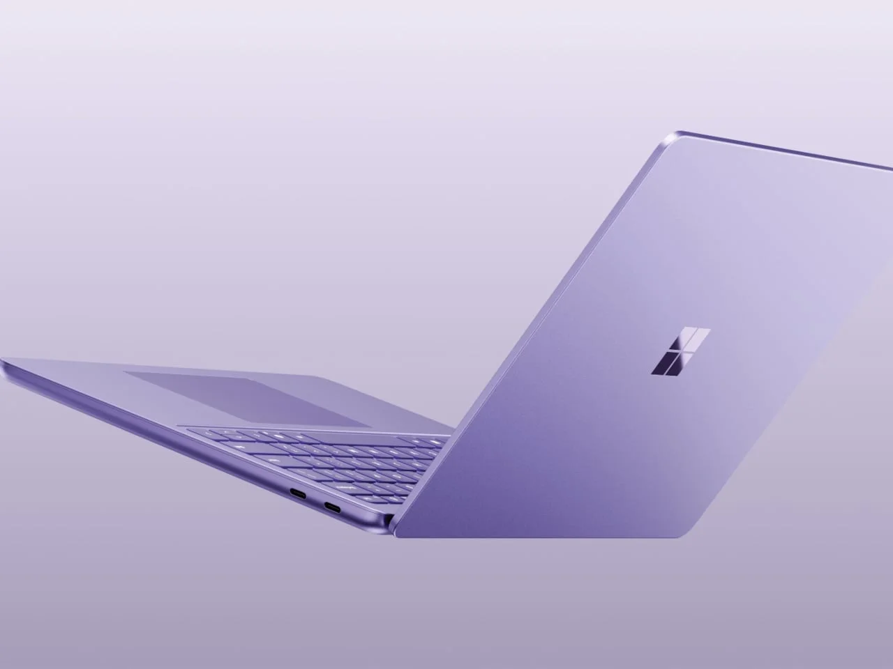
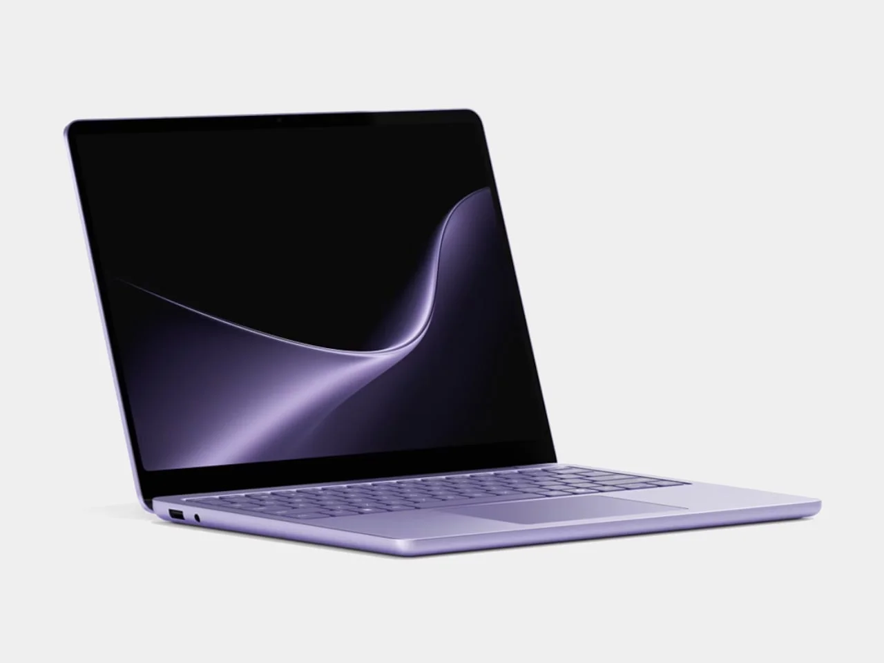
Laptops are a harder test. The Surface Pro 12-inch arrives in a Violet finish, and that matters because Microsoft didn't treat it as a one-off special edition. The color carried into a second generation, sitting alongside the familiar Black and Platinum options. That's a commitment. It suggests the company sees purple as a lasting option rather than a seasonal stunt.
Portable computing has been dominated by silver, gray, and black for so long that a violet tone feels like a real departure. The Surface Pro's clean geometry handles the color well. The violet adds warmth without crowding the minimalist form, which is harder to pull off than it looks.
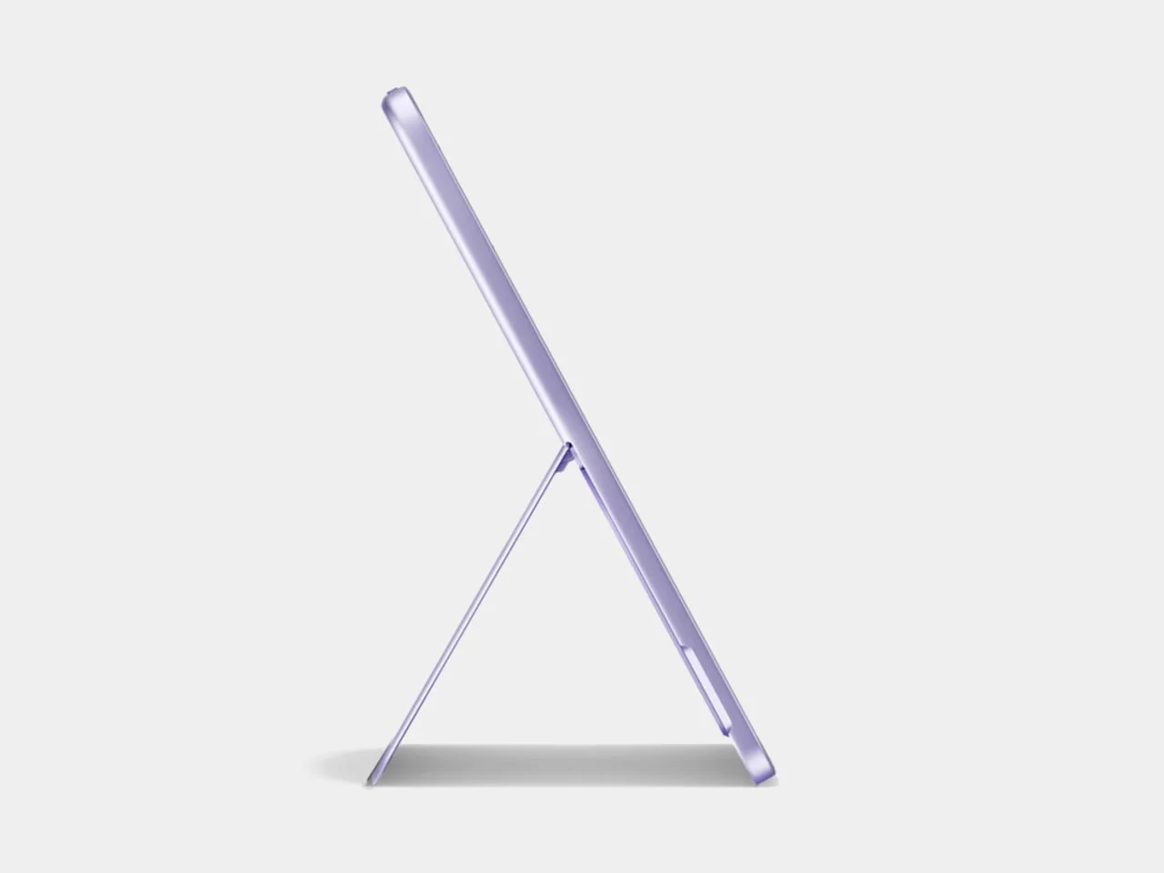
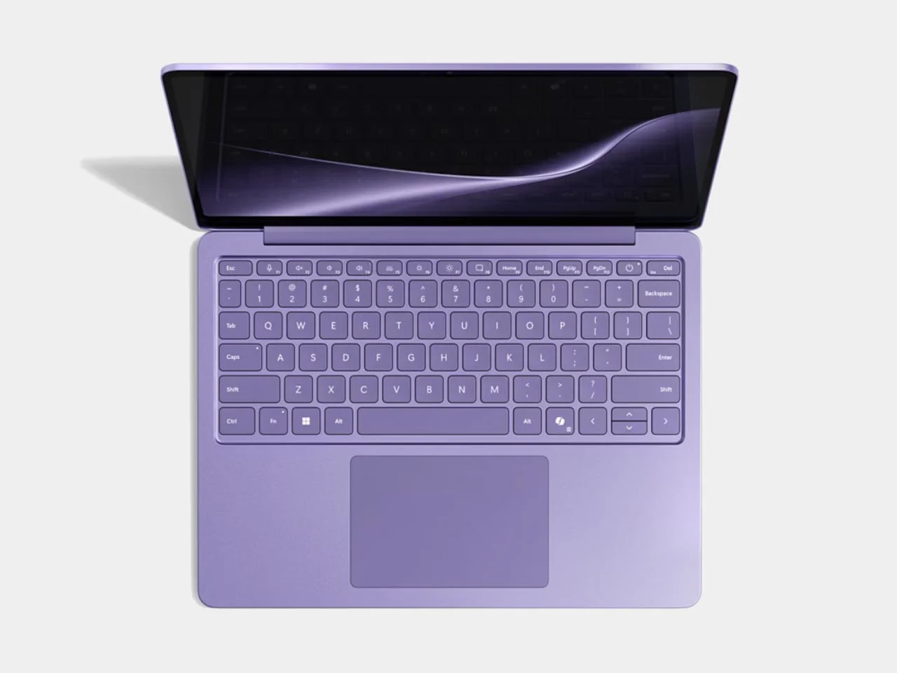
A laptop sits on desks, coffee tables, and kitchen counters, so its color is seen far more often than a spec sheet is read. Purple brings a bit of playfulness into those spaces. The hardware still does the heavy lifting on portability and performance, but the finish changes how the device reads in a room, and that's arguably what buyers notice first.
Soft Shades Make Minimalism Feel Warmer
Purple doesn't have to shout. Muted lavender, lilac, mauve, and dusty violet can sit comfortably inside minimalist interiors. These softer tones pair well with natural wood, brushed metal, stone, glass, and neutral textiles, so they don't overwhelm the room. That makes them especially useful for objects meant to live in homes rather than labs or offices.
This points to a broader change in how minimalism gets defined. For years it meant monochrome surfaces and almost nothing else. Designers are now treating restrained color as another tool. A softly tinted object can interrupt a neutral palette just enough to feel considered, which is a different goal from simply adding decoration.
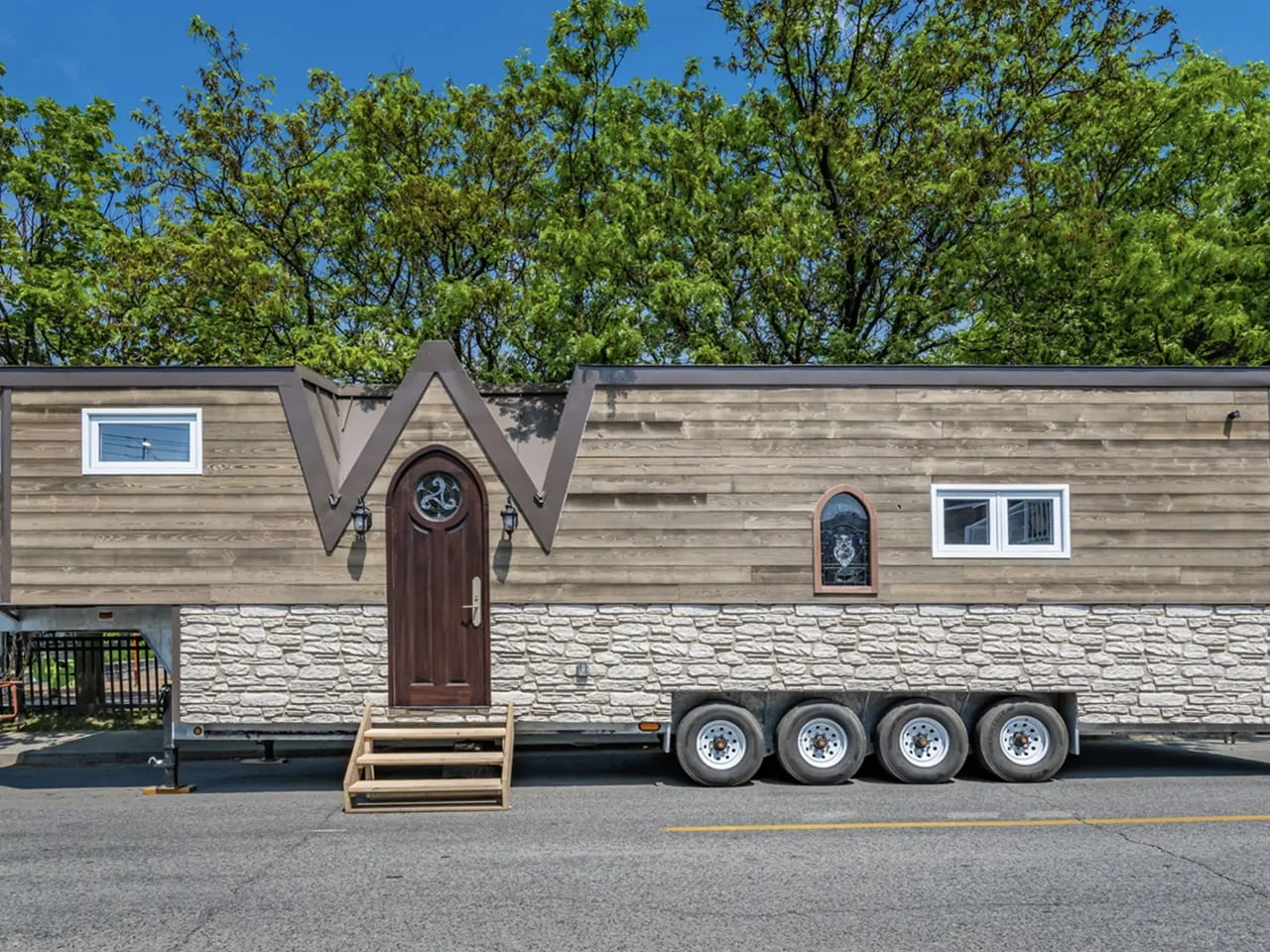
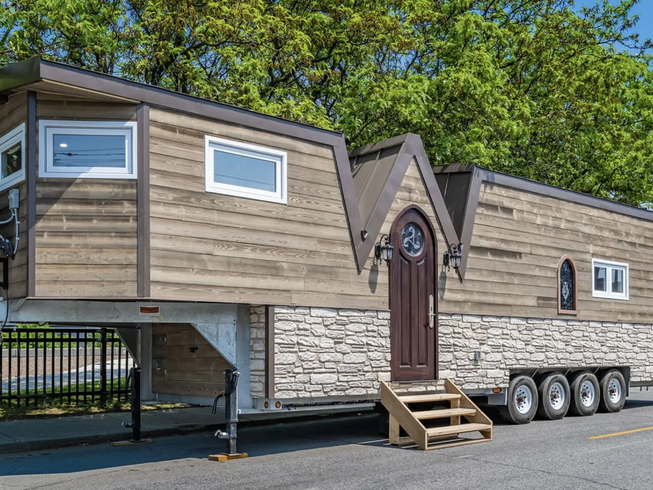
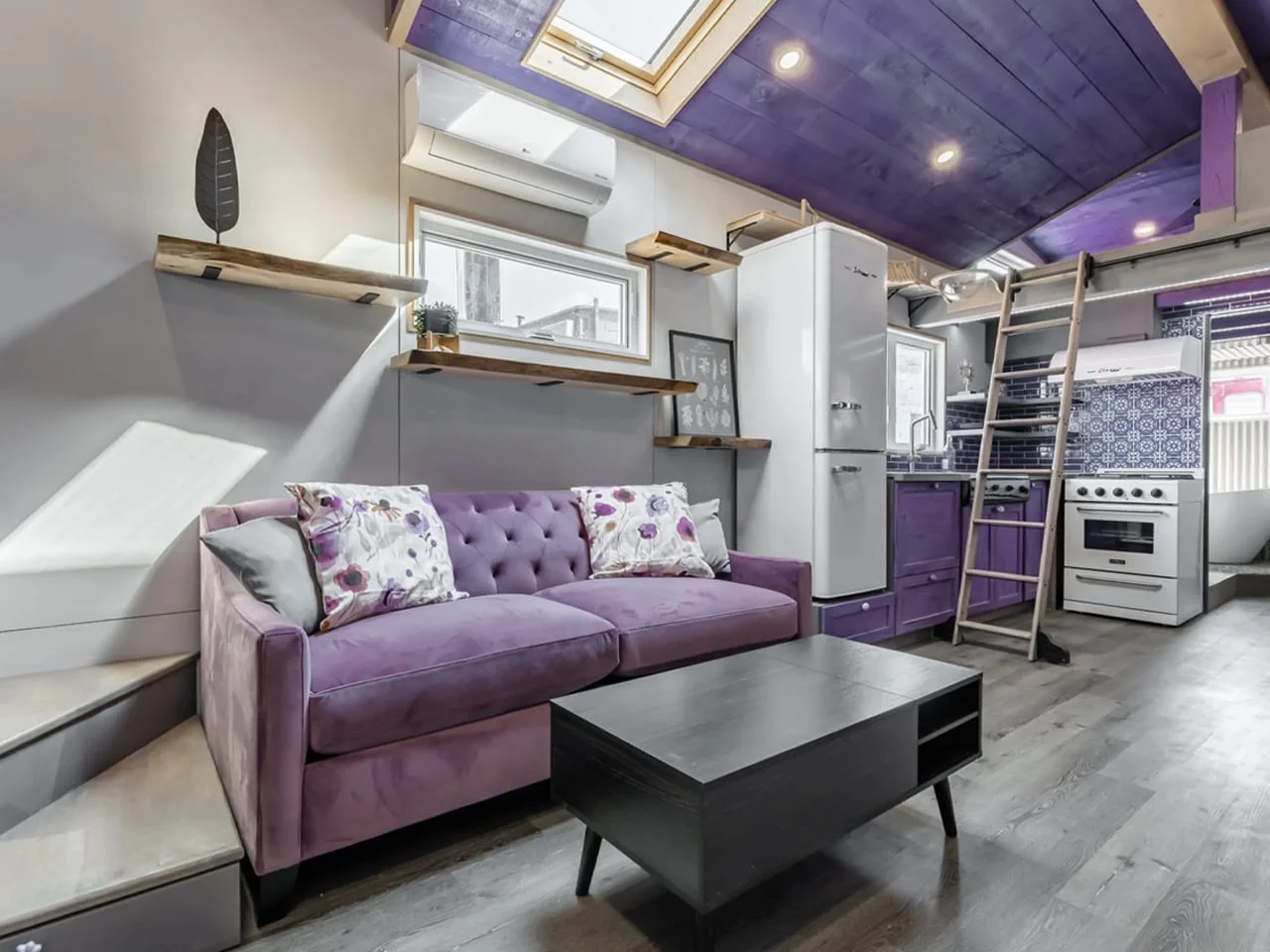
Scale is where this gets fun. The Purple Heart Manor takes purple from accent to architecture. Canada's Acorn Tiny Homes designed the 43-foot towable dwelling around medieval-inspired details and the owner's love of the color. The exterior mixes faux stone and wood siding with a distinctive roofline, and purple accents carry through the interior. A custom purple sofa bed anchors the living room, with floor-to-ceiling bookshelves, a movable library ladder, and separate areas for gaming, dining, and creative work. Even the cat-friendly features, including a rope bridge and a dedicated "catio," feed into the home's highly personal character.
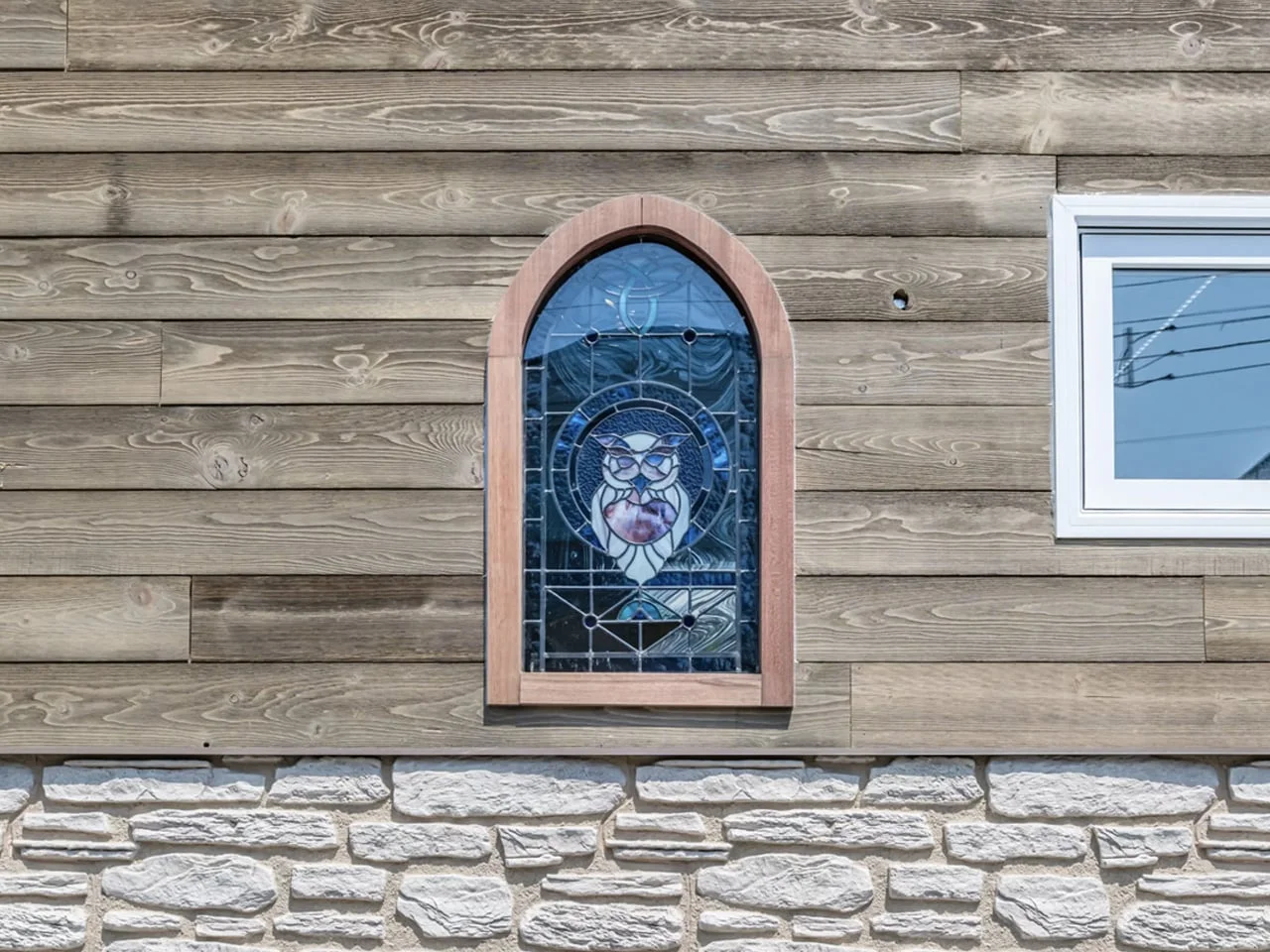
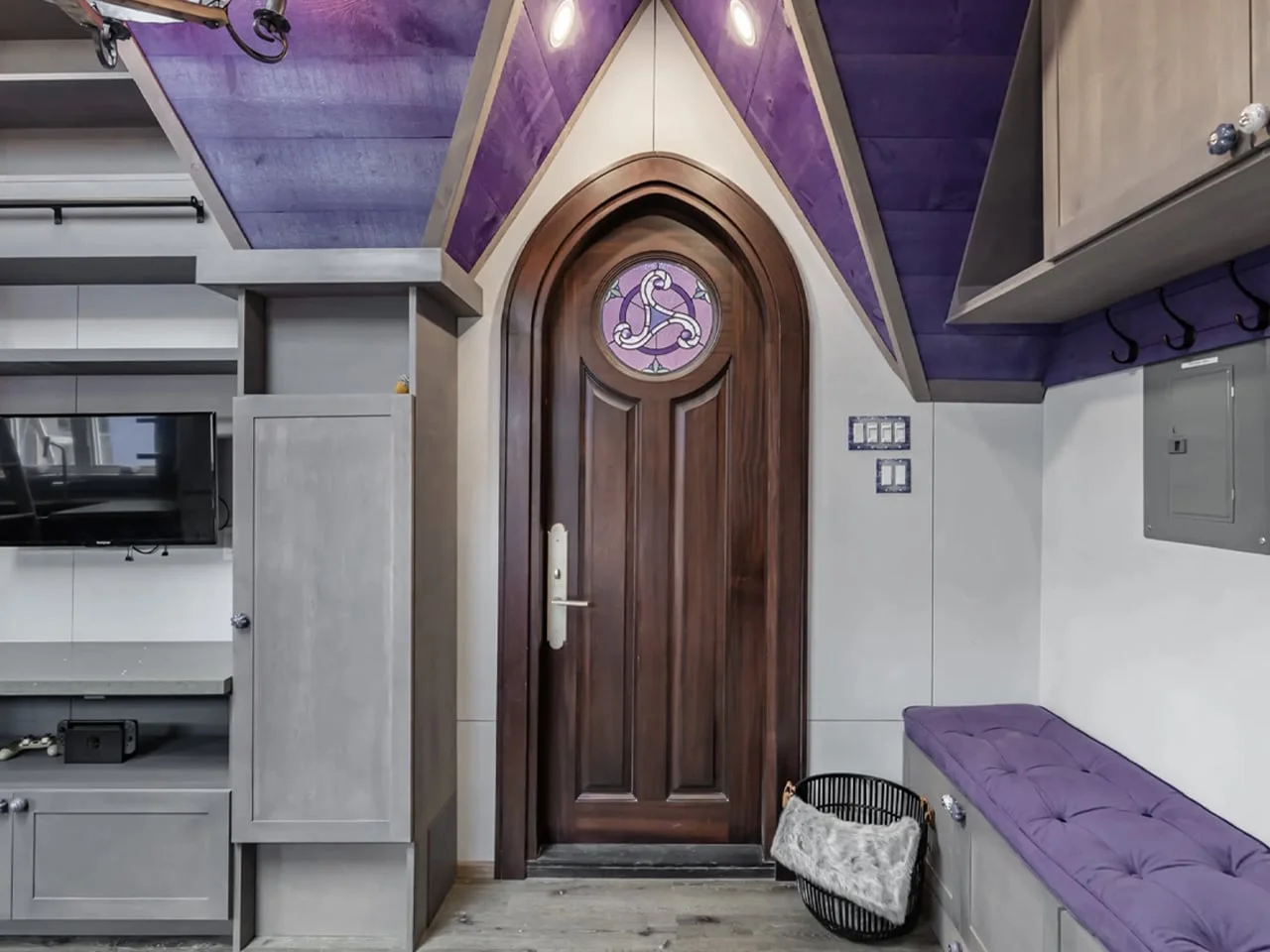
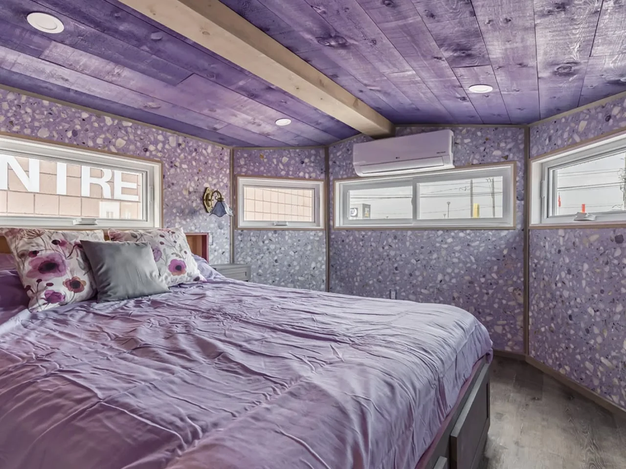
Inside, purple shares the stage with medieval-style wallpaper, stained-glass details, rich wood, and carefully chosen furniture. The kitchen, bathroom, primary bedroom, and loft are roomy enough that the place feels more like a compact apartment than a typical tiny house. It shows how far color can carry a design when it's applied with conviction.
Saturated Violet Is Built for Attention
At the other end of the spectrum sits highly saturated purple, and it works in a different way. A bold violet finish cuts through retail shelves, product photography, and social feeds, where objects compete for a few seconds of attention. For brands that want a memorable visual signature, that's a strong argument.
Purple also reads as experimental, partly because it's still less predictable than the usual product colors. Paired with unusual forms, translucent materials, glossy surfaces, or metallic details, it sharpens the sense of novelty. Used with restraint, a bold purple stops being decoration and becomes part of how the product communicates what it is.
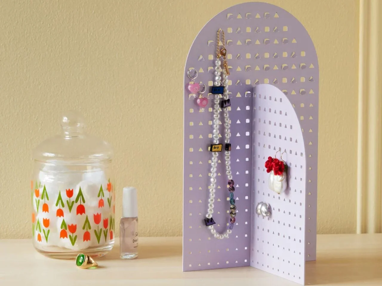
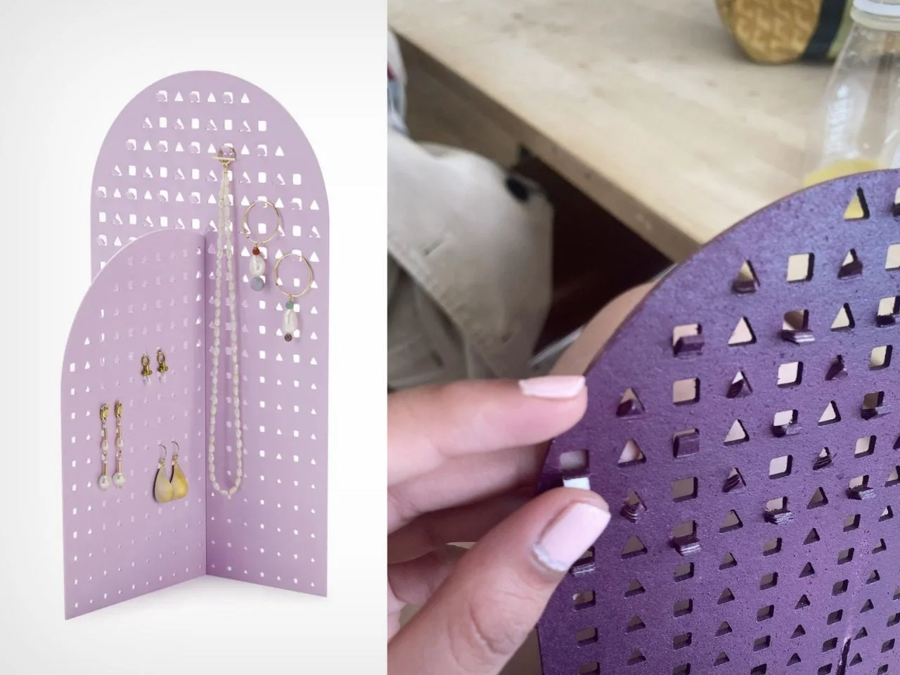
The Modern Geometry Jewelry Stand, designed by Nihaarika Arora for the MoMA Design Store, shows how color can soften hard geometry. Two powder-coated iron panels interlock without fasteners, and the cool, playful palette offsets the rigidity of the metal. The stand reads less like an organizer and more like a small piece of sculpture that happens to hold jewelry.
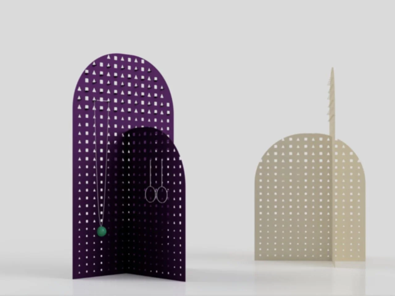
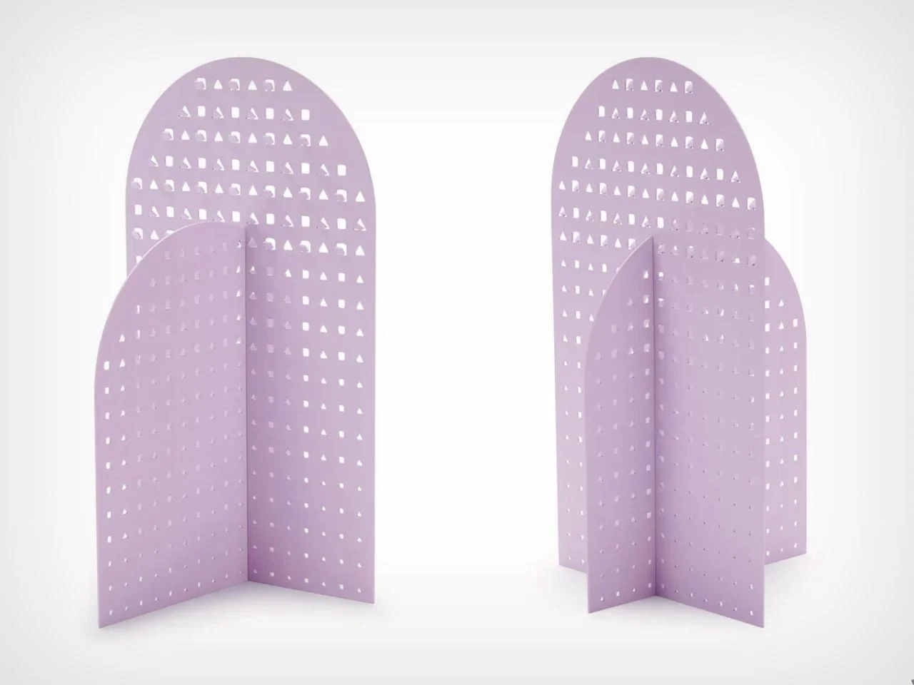
The functional details are clever. Perforated panels let earrings pass straight through the surface, and integrated hooks keep necklaces and bracelets in tidy arrangements. As pieces get added, the color acts as a backdrop that frames different metals, stones, and finishes. The collection becomes a changing composition, and the palette is restrained enough to sit in different rooms without competing with what's on display.
Color Is Becoming Part of the Product Experience
Color is moving upstream in product design. It used to be a finishing decision made late in the process. Now designers are asking how a product should feel before anyone touches it, and they're using color to set mood, identity, and emotional associations from the first glance.
Purple is well suited to that job because its range is so wide. It can feel quiet and refined in one tone and playful in another, depending on material and context. As buyers look for more individuality in the objects around them, expressive color is becoming part of how products make their case.
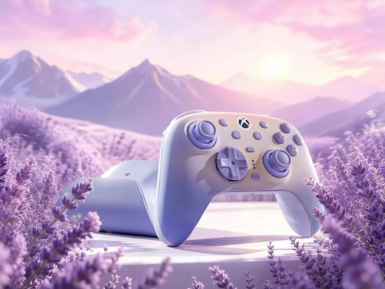
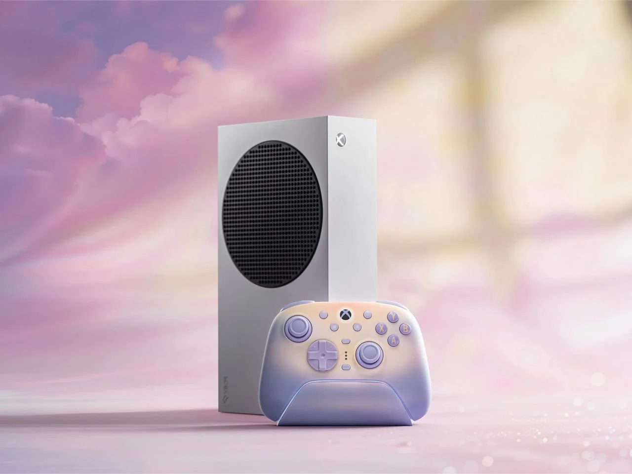
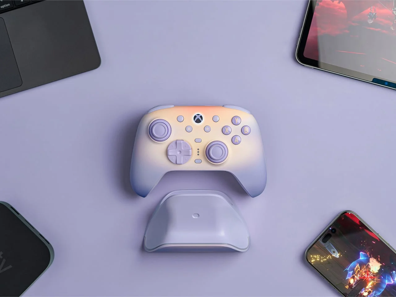
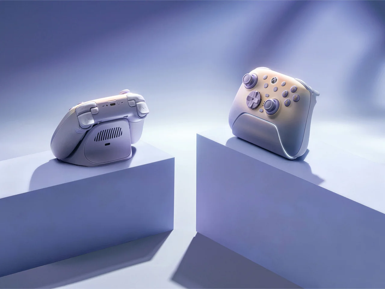
Gaming hardware is a good test case. The 8BitDo Ultimate 3 in Lavender Dusk steps away from the usual black plastic, sharp contrasts, and RGB-heavy styling. Its soft lavender finish draws on Rococo-inspired pastels. The color also shifts with the light, looking cooler in daylight and warmer as evening arrives. That quality gives the controller an atmospheric presence, so it fits into a living room rather than looking like equipment that belongs only in a gaming setup.
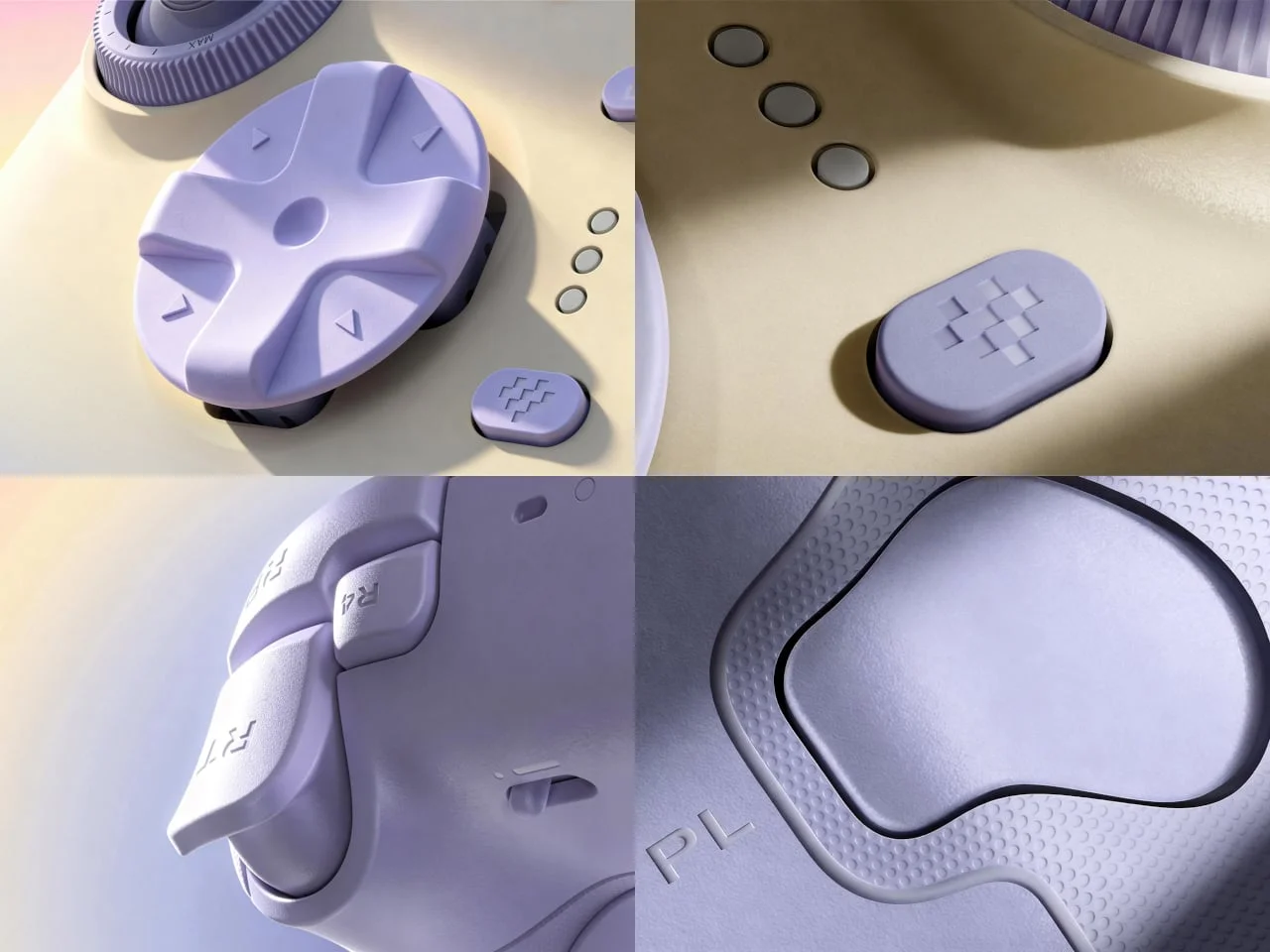
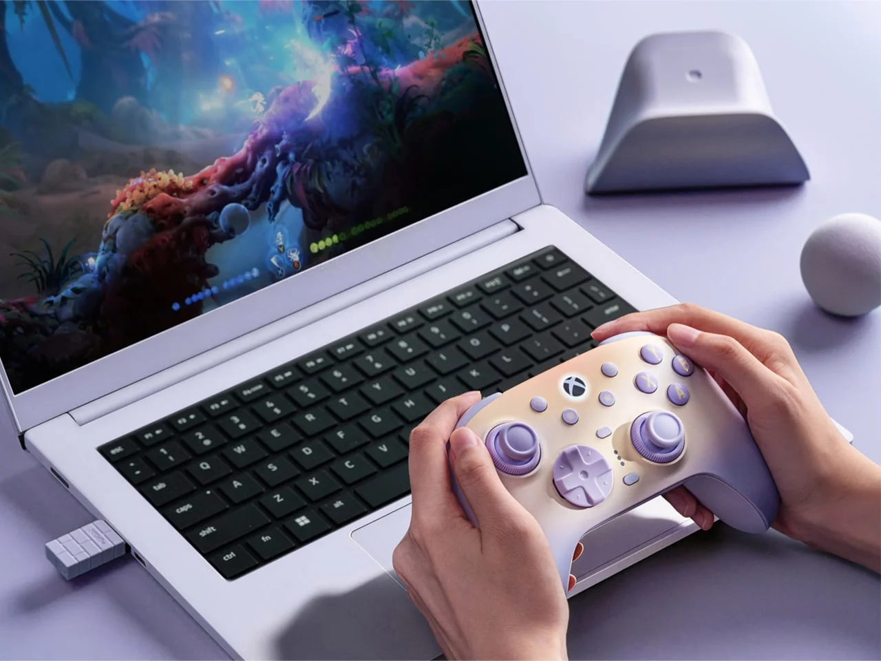
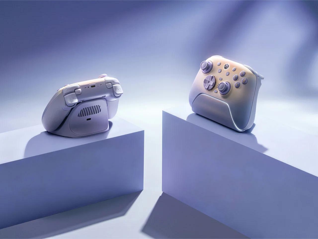
What makes the lavender version work is that the color doesn't replace the performance. TMR joysticks, adjustable Force Ring resistance, Hall-effect triggers, remappable controls, and wireless connectivity all remain central. The finish gives the technology a softer identity without diluting its seriousness.
My read is that purple's comeback is less about a color trend and more about buyers wanting objects that show some personality. The next useful question is whether manufacturers keep treating color as a core design decision rather than a limited-edition afterthought. If they do, expect more products that look like they were chosen, not just bought.
Discussion
Sign in to join the discussion.