Goldie Hawn’s tasteful use of butter yellow in decor epitomizes a stylish trend set to thrive beyond 2026. Here’s how to incorporate this enduring hue.
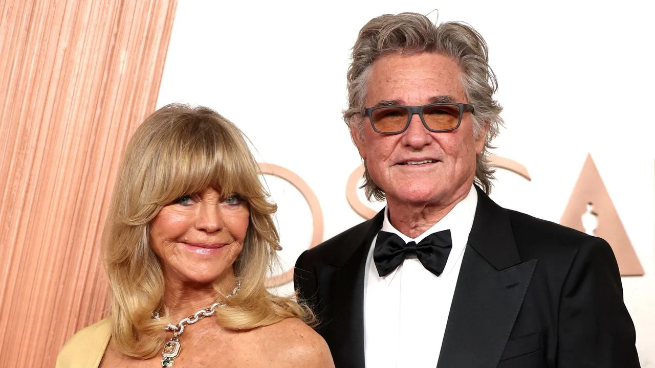
Butter yellow is undeniably taking center stage in interior design as we approach 2026, perfectly capturing the essence of a cozy winter day or the refreshing aura of early spring. This shade, with its gentle luminosity, resonates in a way that few colors can. It's a hue that evokes warmth and comfort, reminiscent of sun-kissed mornings. While this hue is having its moment now, Goldie Hawn has been advocating for it since 2020, showcasing how effectively it can transform living spaces. Her choice of decor continues to resonate, proving that not all style trends are fleeting. In an age where color trends often pivot rapidly, Hawn’s consistent advocacy for butter yellow is a reminder that some choices have lasting power.
Goldie Hawn’s Timeless Aesthetic
Throughout 2026, many public figures have embraced this cheerful shade, but Hawn’s aesthetic remains exemplary amidst a sea of alternatives. Where typical trends involve painting walls or choosing large furniture pieces, her living room elegantly demonstrates that smaller items—like an armchair—can still make a significant impact. The armchair's soft hue pairs impeccably with neutral shades, establishing a balanced aesthetic that endures through all seasons. It’s a subtle yet effective approach that allows the color to shine without overwhelming the space. This style contrasts sharply with trendier, louder palettes that often dominate magazine covers, making Hawn’s choice all the more striking for its simplicity and elegance.
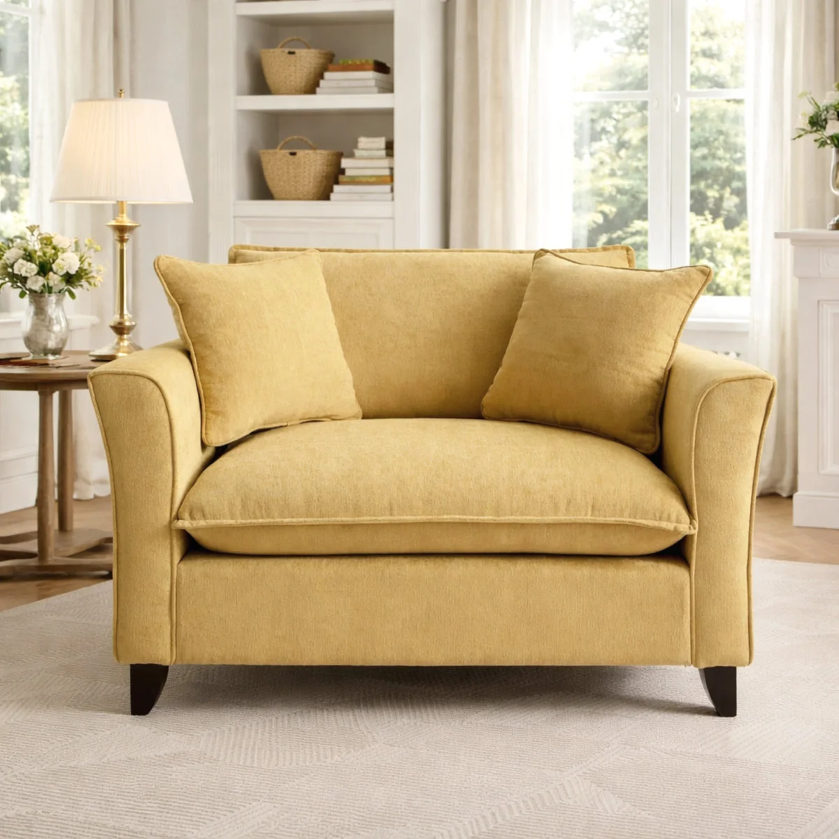
If you're looking to replicate Goldie’s style, consider this Lark Manor chenille armchair from Wayfair. Its warm butter yellow not only adds a pop of color, but it also holds its charm over the years, proving a worthwhile investment. This is more significant than it looks: selecting such pieces allows homeowners to integrate current trends without committing to a complete overhaul of their decor. It means you can make bold design statements without the stress of extensive renovations.
Explore Decor Inspired by Goldie and Kurt
 Editor's Choice
This soft butter yellow chair is a brilliant way to infuse a trending color into a living room, perfect against neutral walls.
Hawn’s living room also features design elements that include a cozy white shag rug, a stylish complement that enhances the ambiance without dulling the overall look. Rugs serve a dual purpose here. They not only add texture but also introduce another layer of comfort and warmth that is essential for making a space feel inviting.
Bright Accents that Elevate Spaces
For those looking to channel Goldie's vibe, introducing butter yellow through cozy throws or decorative cushions offers a less daunting approach than committing to larger items. Subtle accents allow you to experiment with the color trend without overwhelming your existing decor. Design expert Magdalena Gierasinska emphasizes the soft warmth butter yellow brings, helping create a serene environment in any room. She explains how the color captures light beautifully, creating a radiant effect that enhances the emotional appeal of the space.
As Gierasinska points out, “This hue evokes a laid-back charm, making it versatile for textiles.” Butter yellow’s inviting aura effectively complements neutral tones, enriching the comfort of a space while providing visual interest. This color can transform an otherwise mundane room into a joyful retreat with minimal effort.
As we approach 2027, trends reveal that colors like butter yellow not only trend well but bring ongoing value. Gierasinska also highlights its adaptability in layered, tonal decor settings which pair gracefully with modern or classic furniture. This isn’t just about aesthetics; it’s a strategy that allows your decor to age with dignity, avoiding the pitfalls of passing fads. “When used thoughtfully, this color adds a timeless appeal to any decor,” she notes, allowing homeowners to feel confident in their design choices for the long haul.
The ongoing popularity of butter yellow makes it a smart choice for decorating strategies that extend beyond the current year. By choosing statement pieces or delicate accents, you ensure your decor feels both contemporary and enduring. If you find joy in mixing celebrities with interior design insights, consider subscribing to our newsletter for the latest trends and tips delivered right to your inbox.
Future Outlook for Butter Yellow and Home Design
What this means for you, the consumer or design enthusiast, is that butter yellow might not just be a passing trend, but a potential staple in future design narratives. The emotional resonance this color evokes could keep it relevant for years to come. Designers are increasingly exploring how colors can embody feelings—aspects that resonate deeply, enriching personal spaces in meaningful ways.
Keep an eye out for how butter yellow might integrate into upcoming collections and designs. You'll likely see it blend with other earthy tones, enriching palettes that reflect an intentional shift toward comfort and simplicity. As consumers continue to seek spaces that evoke warmth and belonging, colors like this one will undoubtedly play a significant role in shaping the aesthetic choices of future interiors. (And this is the part most people overlook.) The future of color in home design is often interconnected with societal emotions and collective experiences, a narrative that continues to evolve.
Discussion
Sign in to join the discussion.